Portfolio
Take a look at some of our recent projects – great looking, beautifully executed signage solutions that perform well and last.
If you would like to learn a little more about these projects, the way we work and the benefits we can bring to your next signage or signwriting project however large or small – give us a call or click below.
Recent projects
Recent projects
 Button
 Button
 Button
Slide title
Write your caption hereButton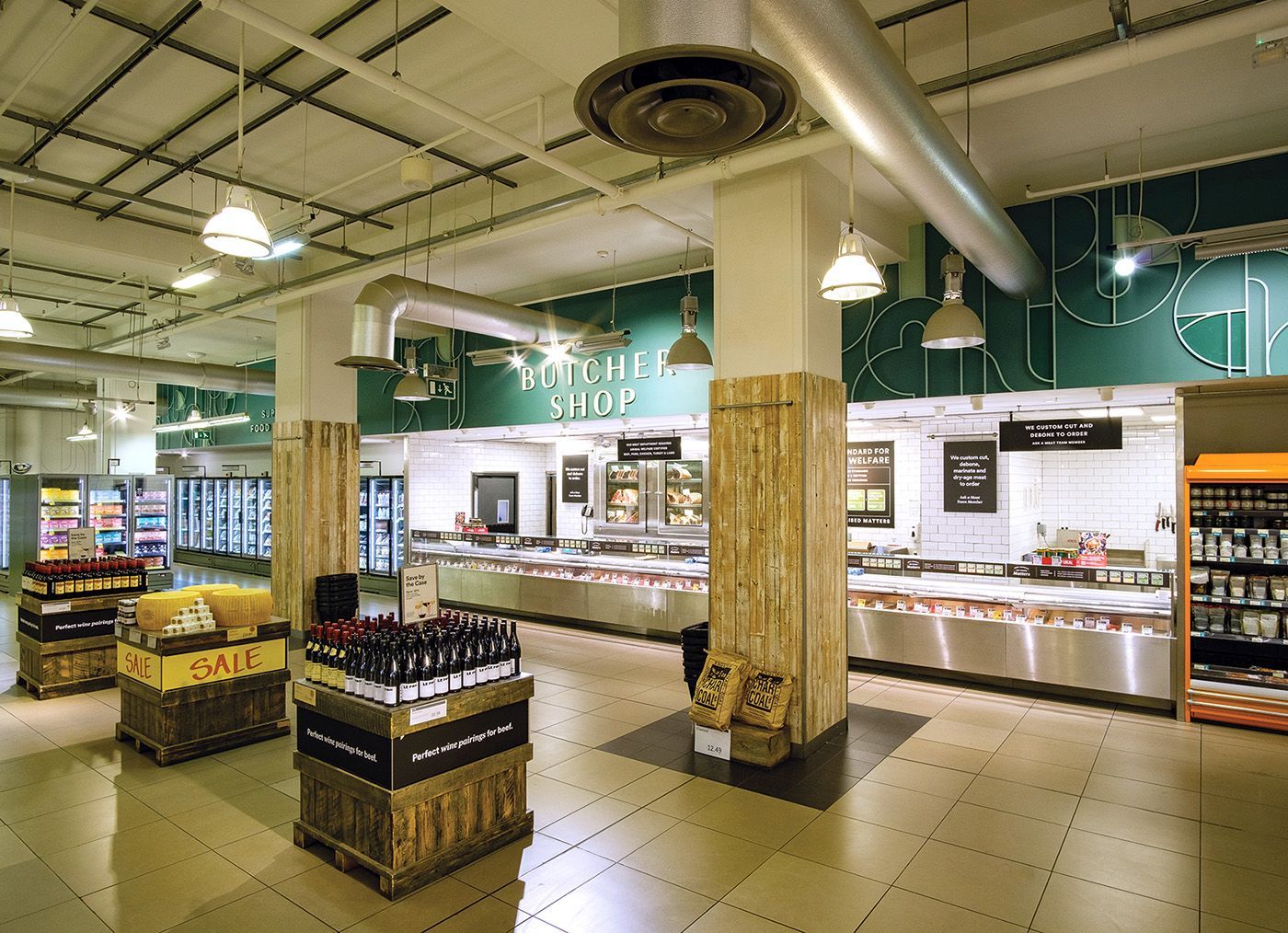
Slide title
Write your caption hereButton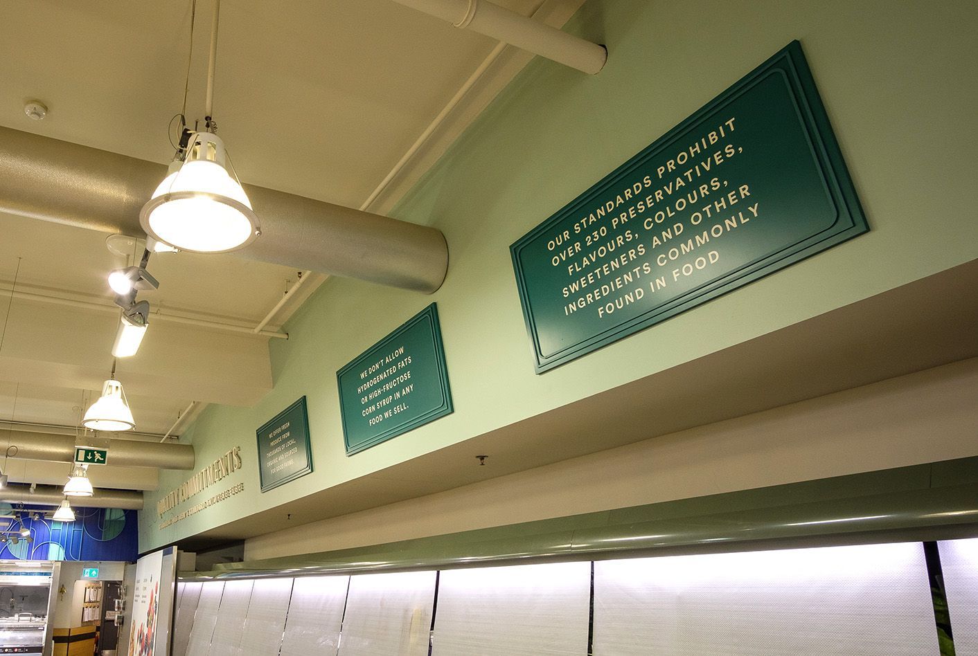
Slide title
Write your caption hereButton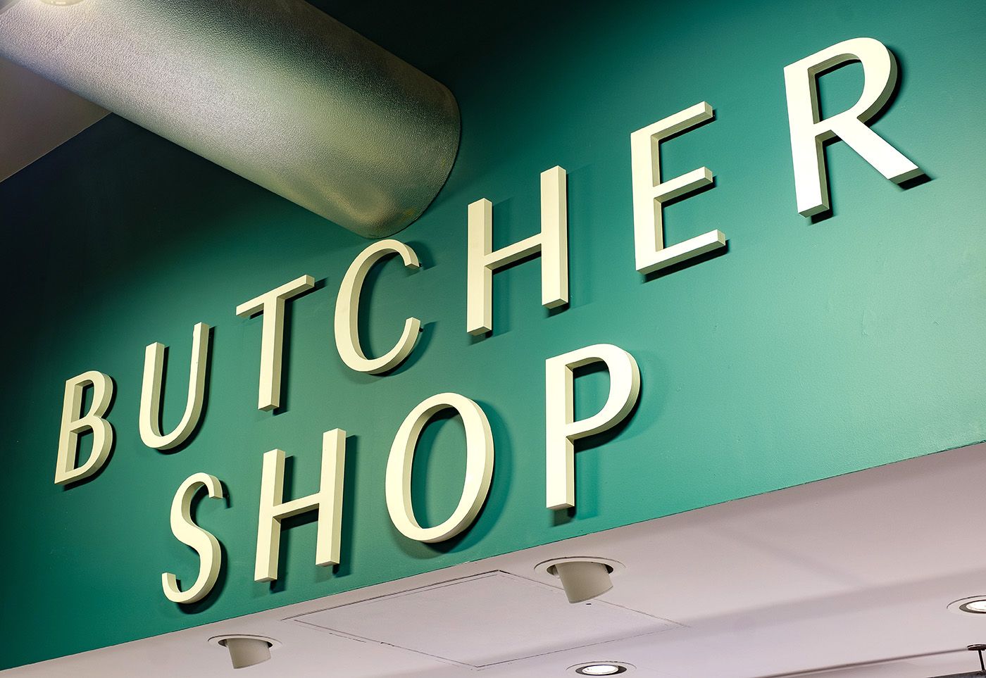
Slide title
Write your caption hereButton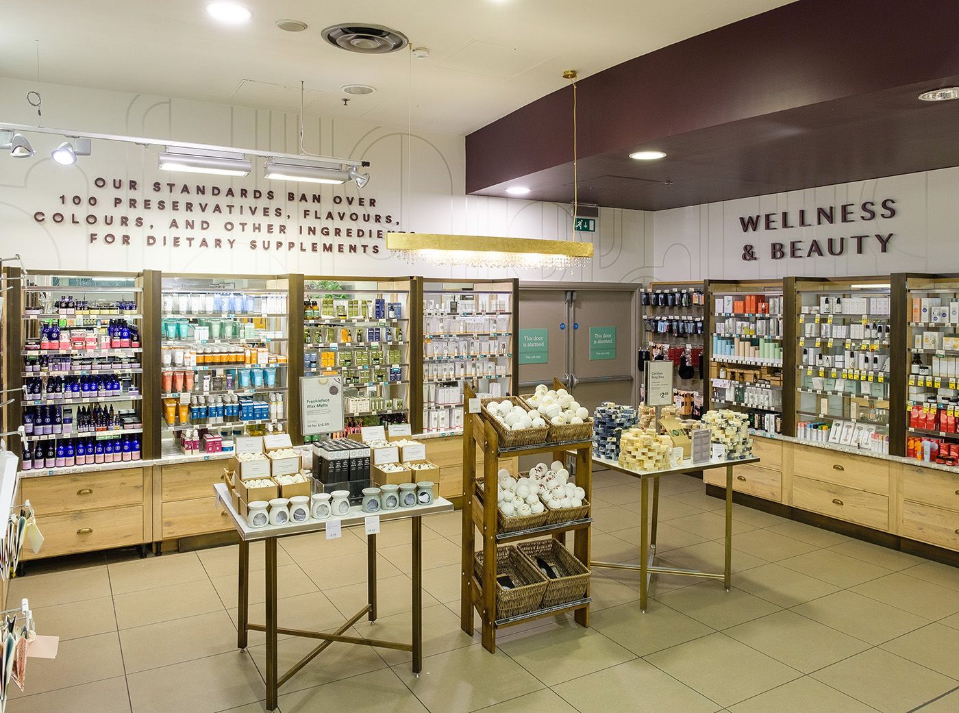
Slide title
Write your caption hereButton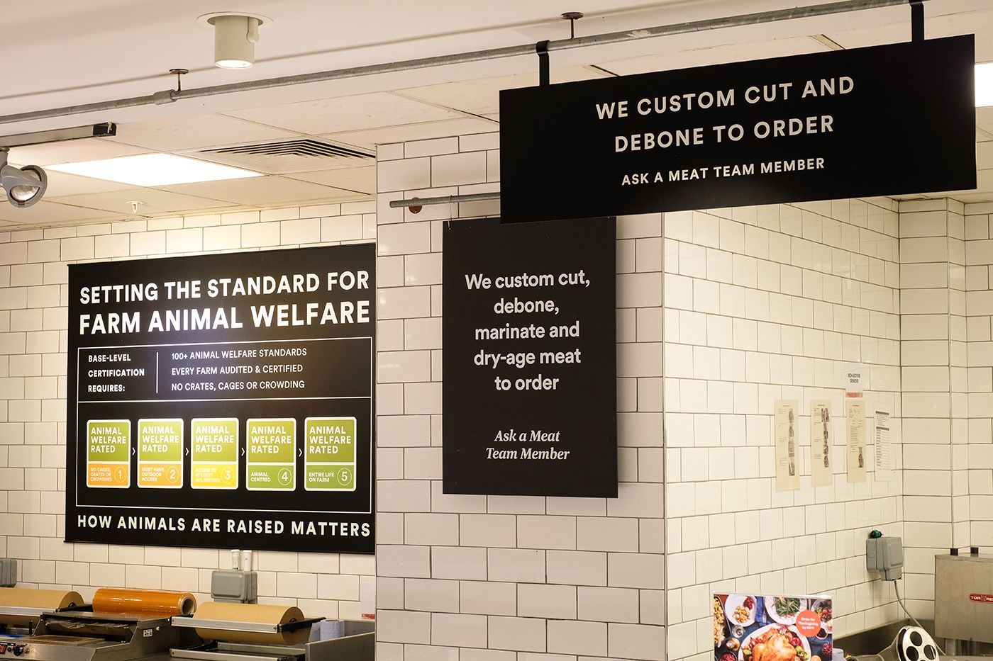
Slide title
Write your caption hereButton
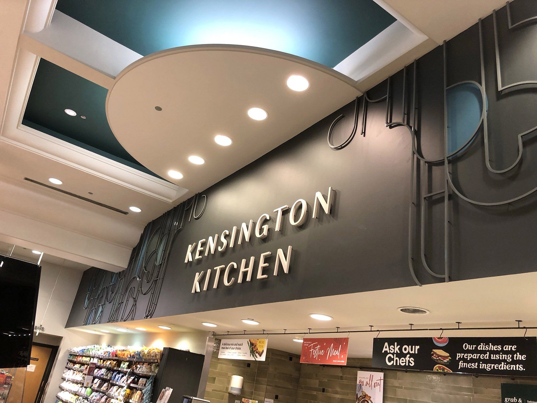
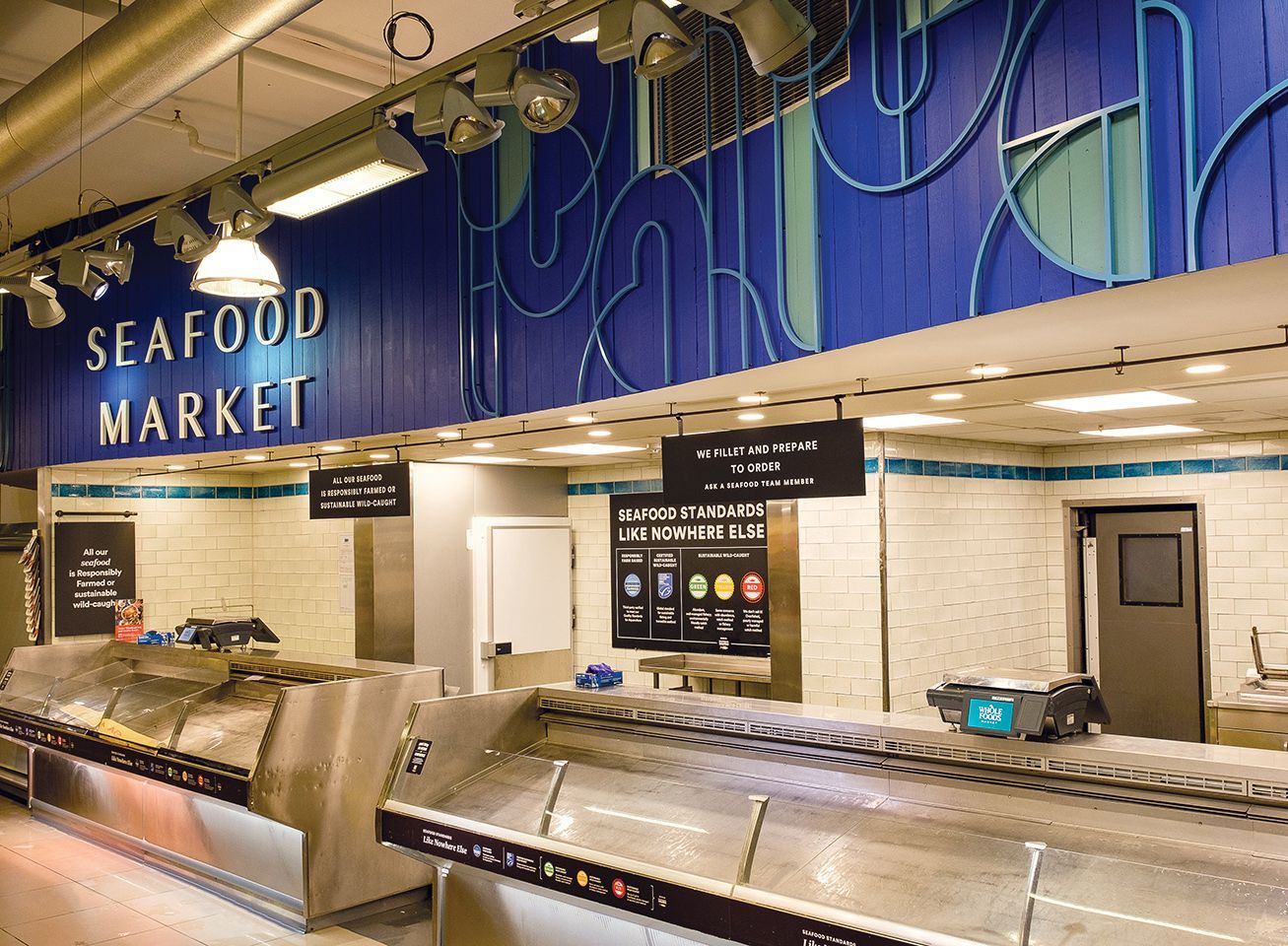
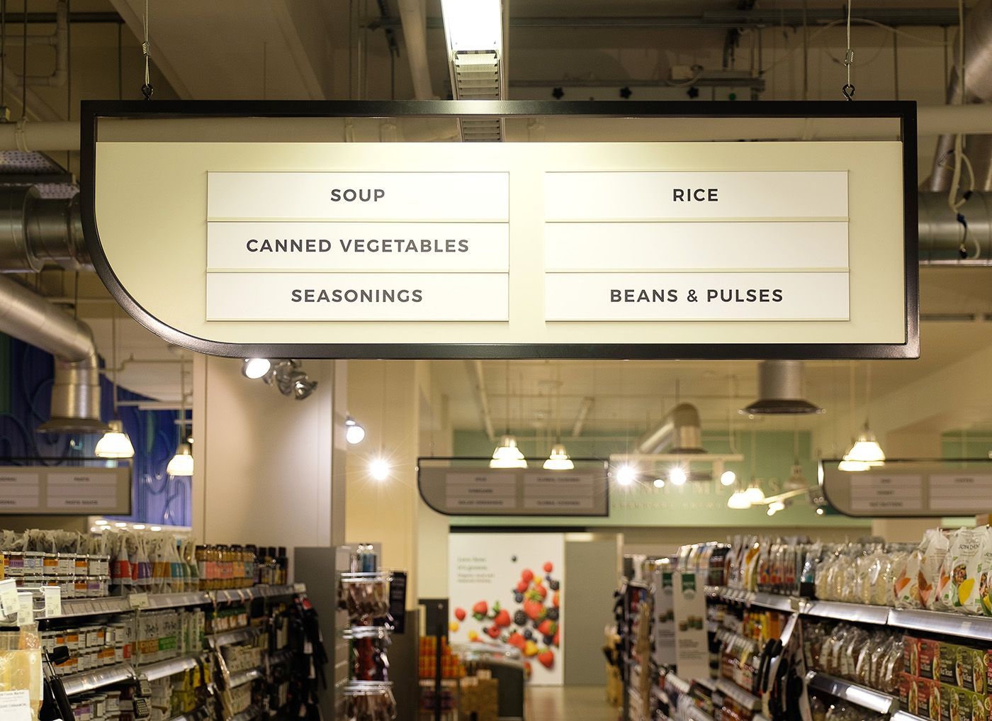
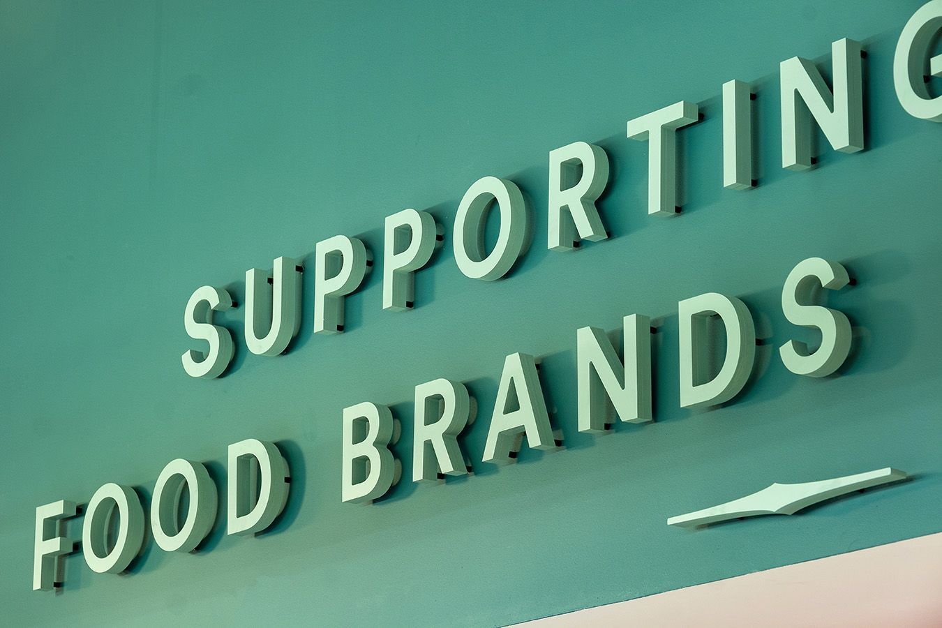
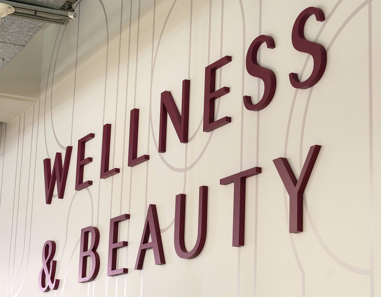
Whole Foods Market – Kensington Lower Ground Floor Signage Refresh
Working with the approved brief from SE retail in South Carolina, USA. Works consisted of 15mm acrylic lines and shapes spray painted in a gloss finish and to compliment these, 25mm thick acrylic letters finished in matt. All on bespoke locator fixings. Within the art deco shaped acrylic we hand painted the walls in Little Greene paint to introduce complimentary colours.
12No bespoke aluminium aisle signs were also supplied and installed with slide in/out sections to enable staff to move the produce and then the name with ease. 6No printed foamex wayfinding signs were also supplied and installed to allow the journey around the store easier to navigate.
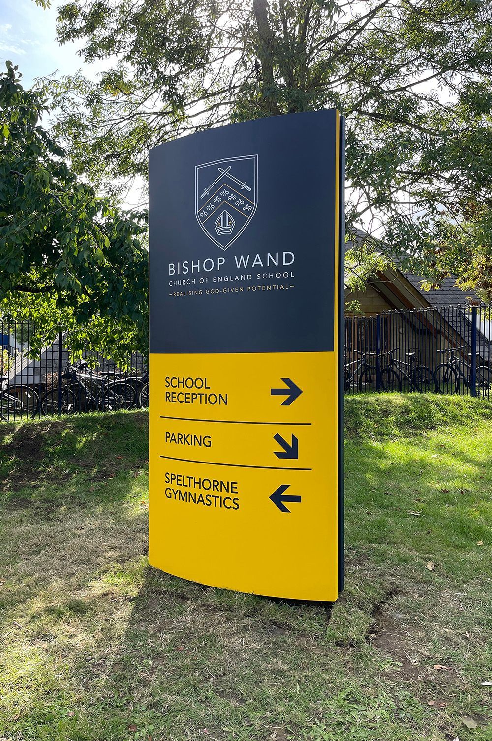
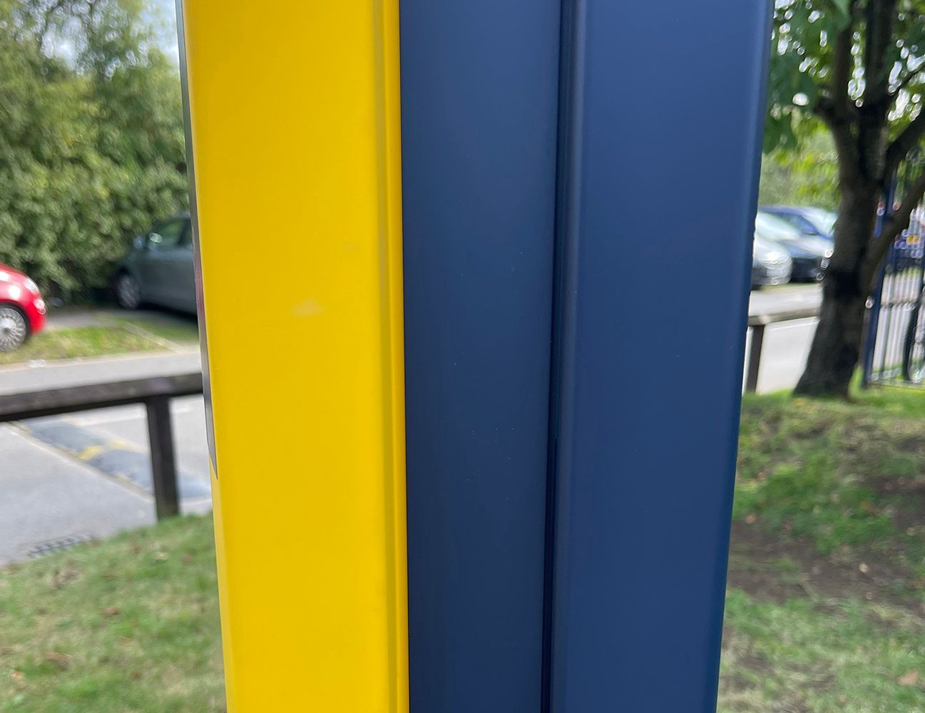
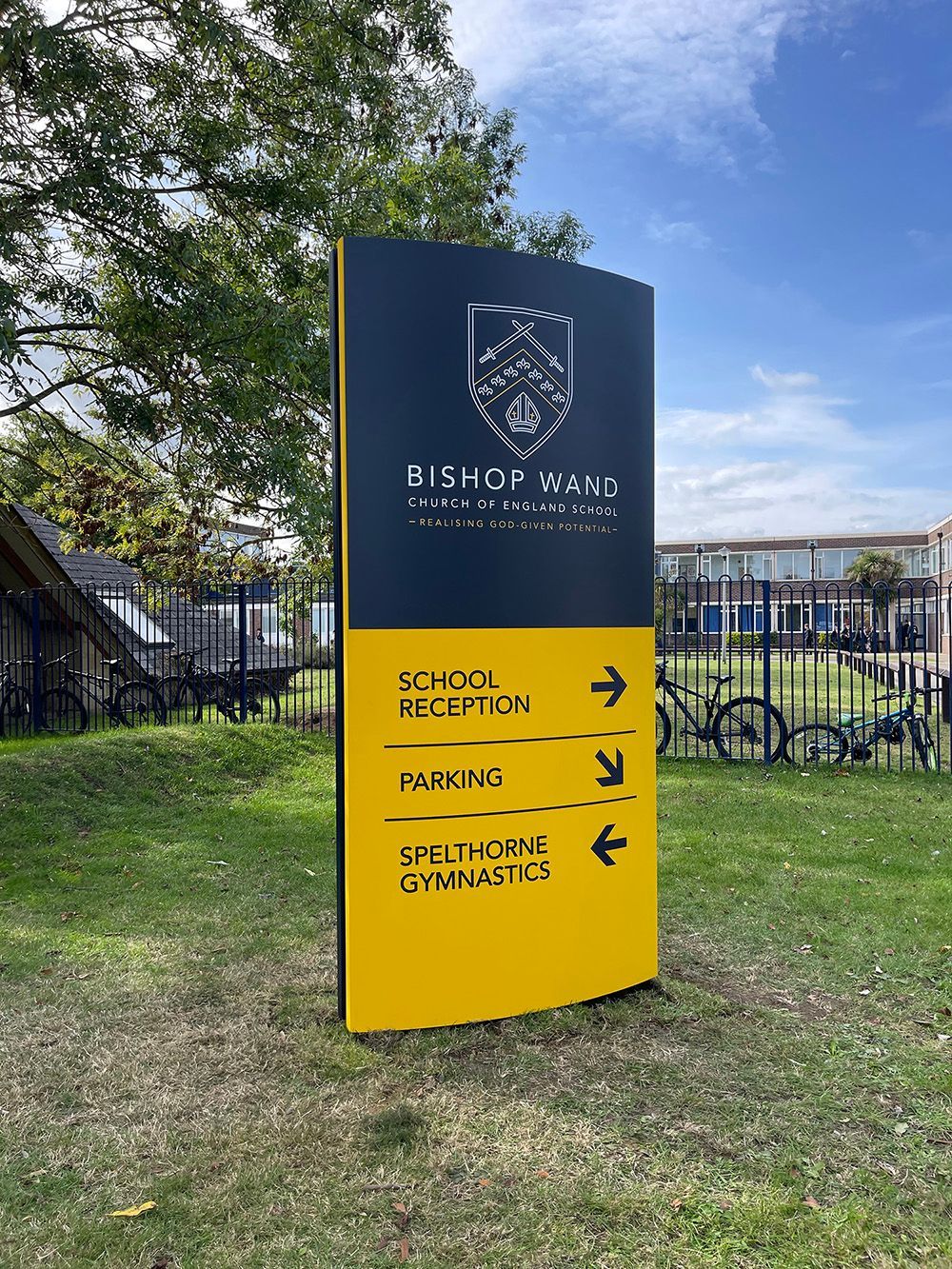
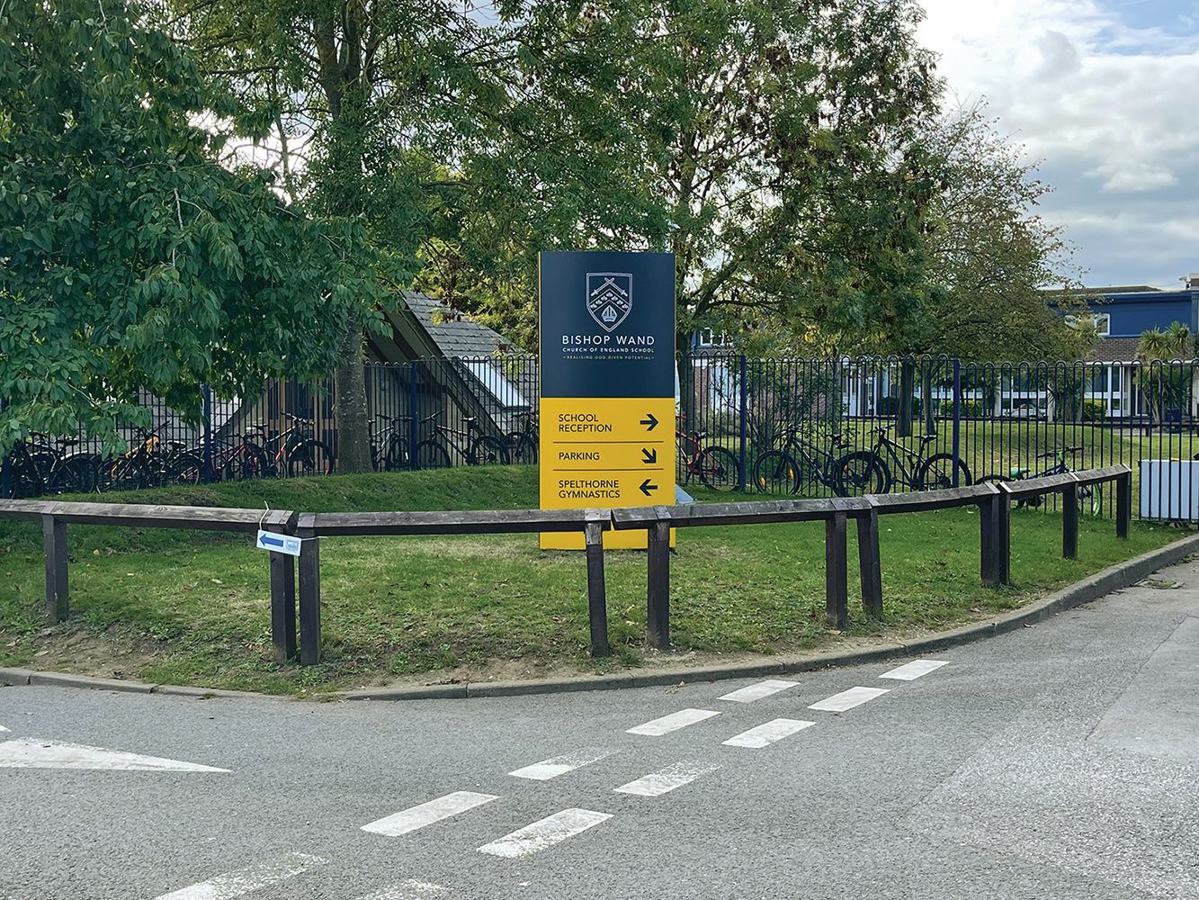
Bishop Wand School, Sunbury
To complete the refurbishment work and major updates to the school, it was time for a new sign. Our client had a very tired 80s sign and a new sign had to reflect the work undertaken and a more modern day design and use of materials.
A bespoke fabricated monolith was chosen in a size and finish to suit the new location and to eliminate car headlight reflection in the winter months. The client had a good eye for detail and chose to have recessed edges as well as a flat back to the sign. It was very well received by all staff and even the pupils taking photos before the installation was complete.
 Button
 Button
 Button
Slide title
Write your caption hereButton
 Button
 Button
 Button
Slide title
Write your caption hereButton
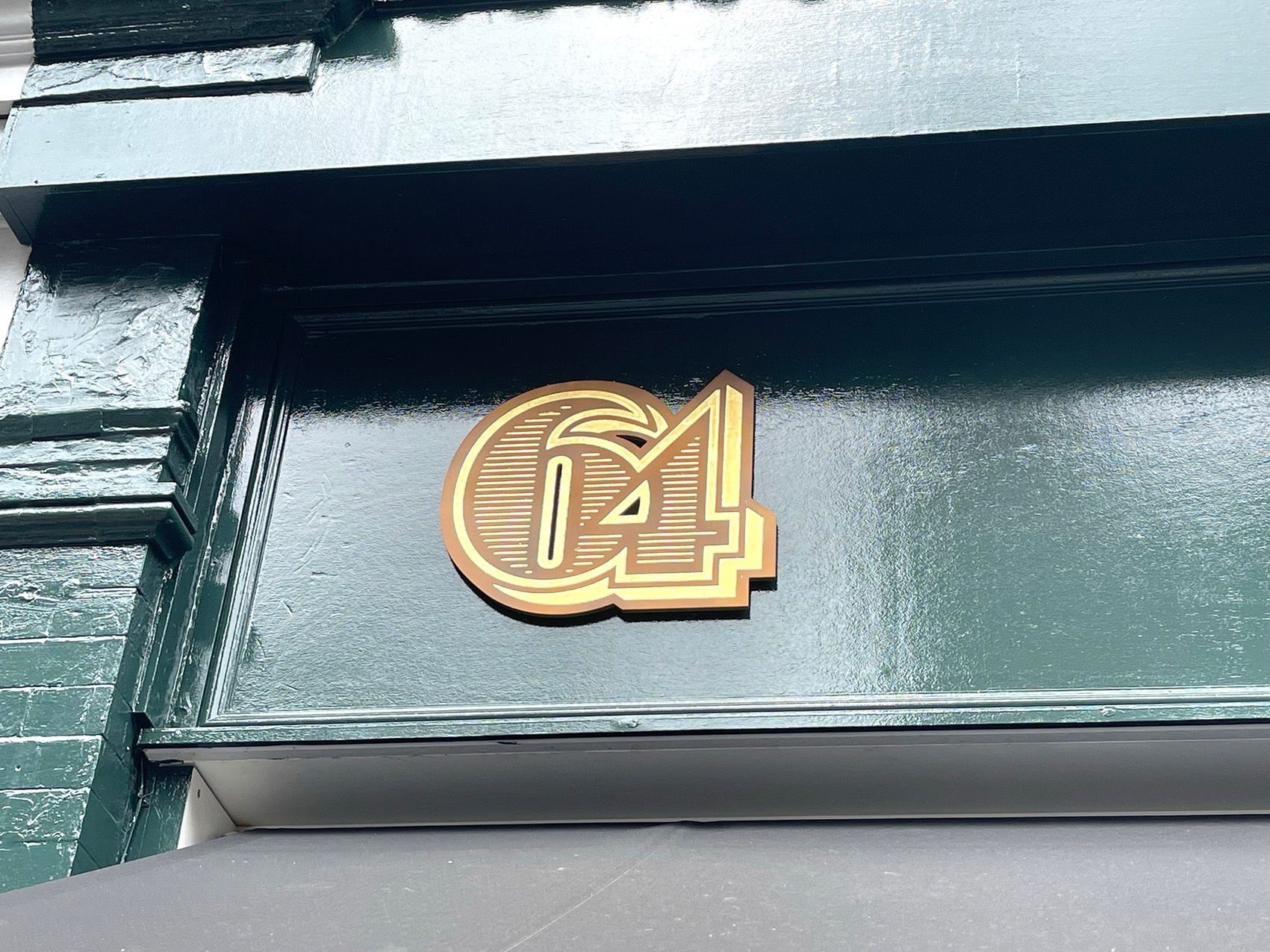
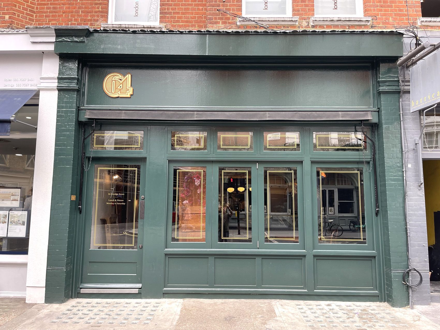
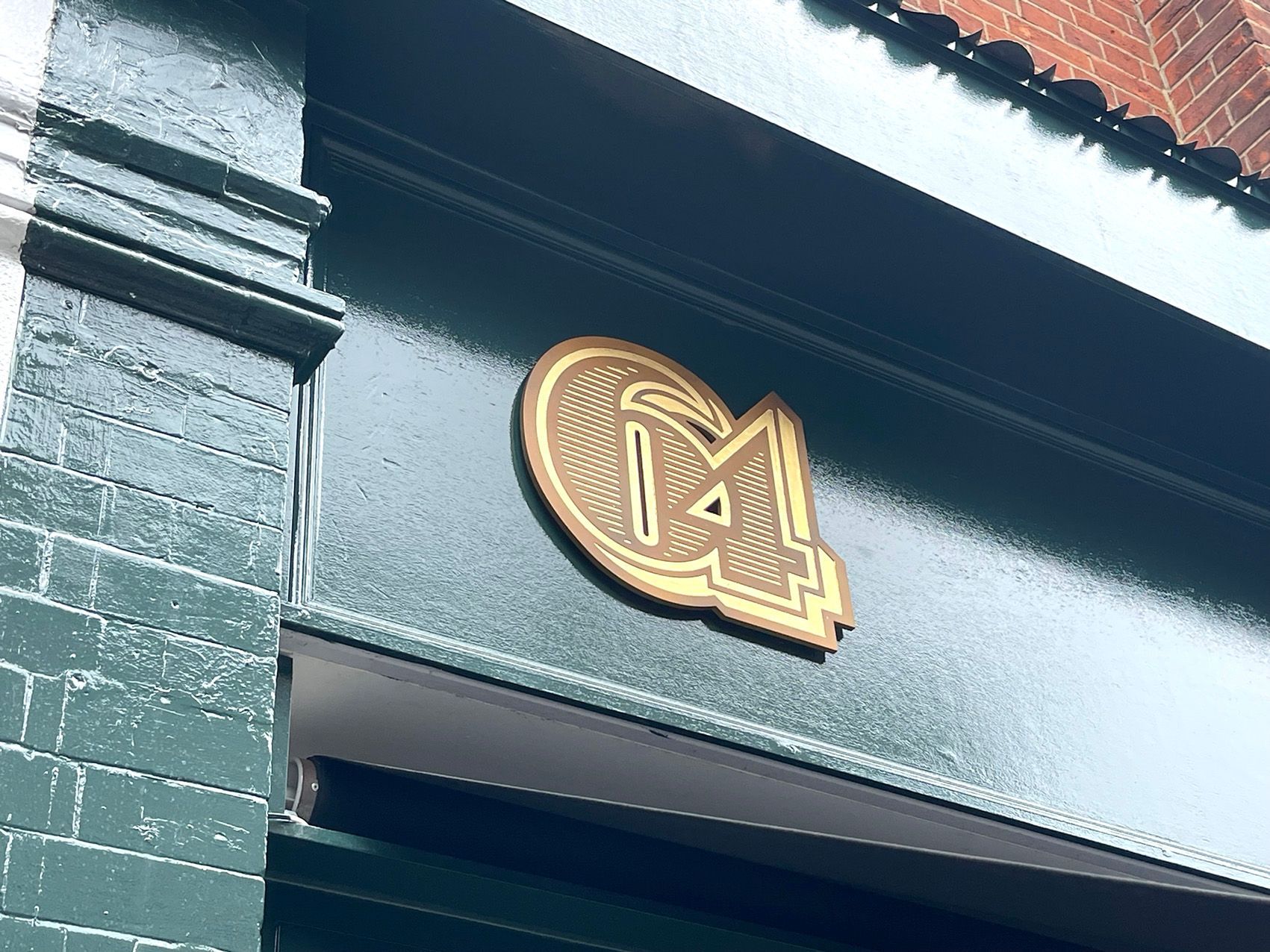
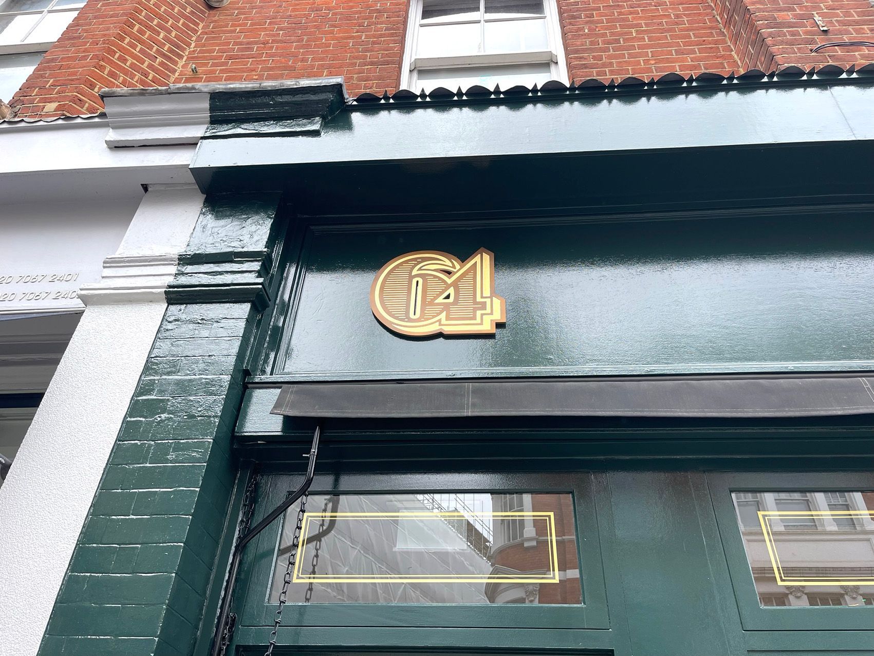
64 Goodge Street
Working with design agency Everything in Between and the Restaurant owners Woodhead Restaurant Group we were asked to produce an aged looking sign to reflect the aesthetics of the building. There was a large use of aged brass within the restaurant and we brought this effect outside with a slight modern twist. Using our CNC machine, we cut the 64 shape out of 10mm acrylic and distress sprayed it to look like aged brass. All the detail was then gold leaf gilded using 23.75 ct gold leaf.
“Thank you for all your beautiful work; we're so pleased with how it has turned out.”
Hugo Schlesinger
Head of Business Development
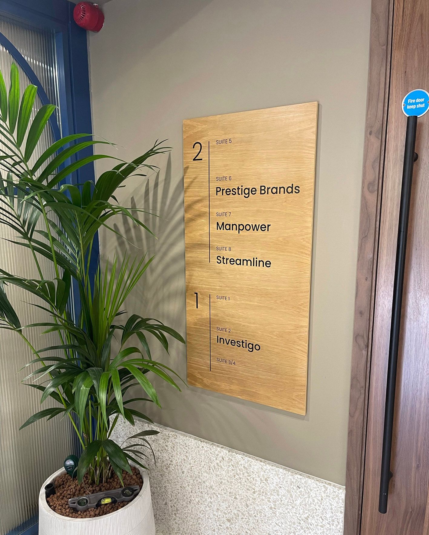
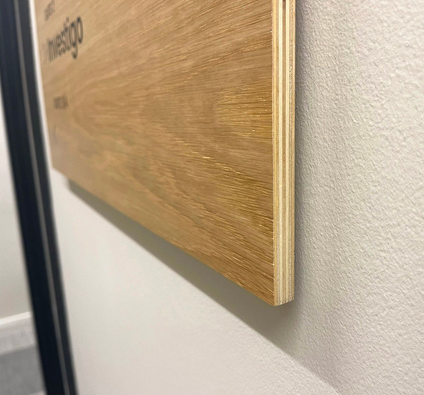
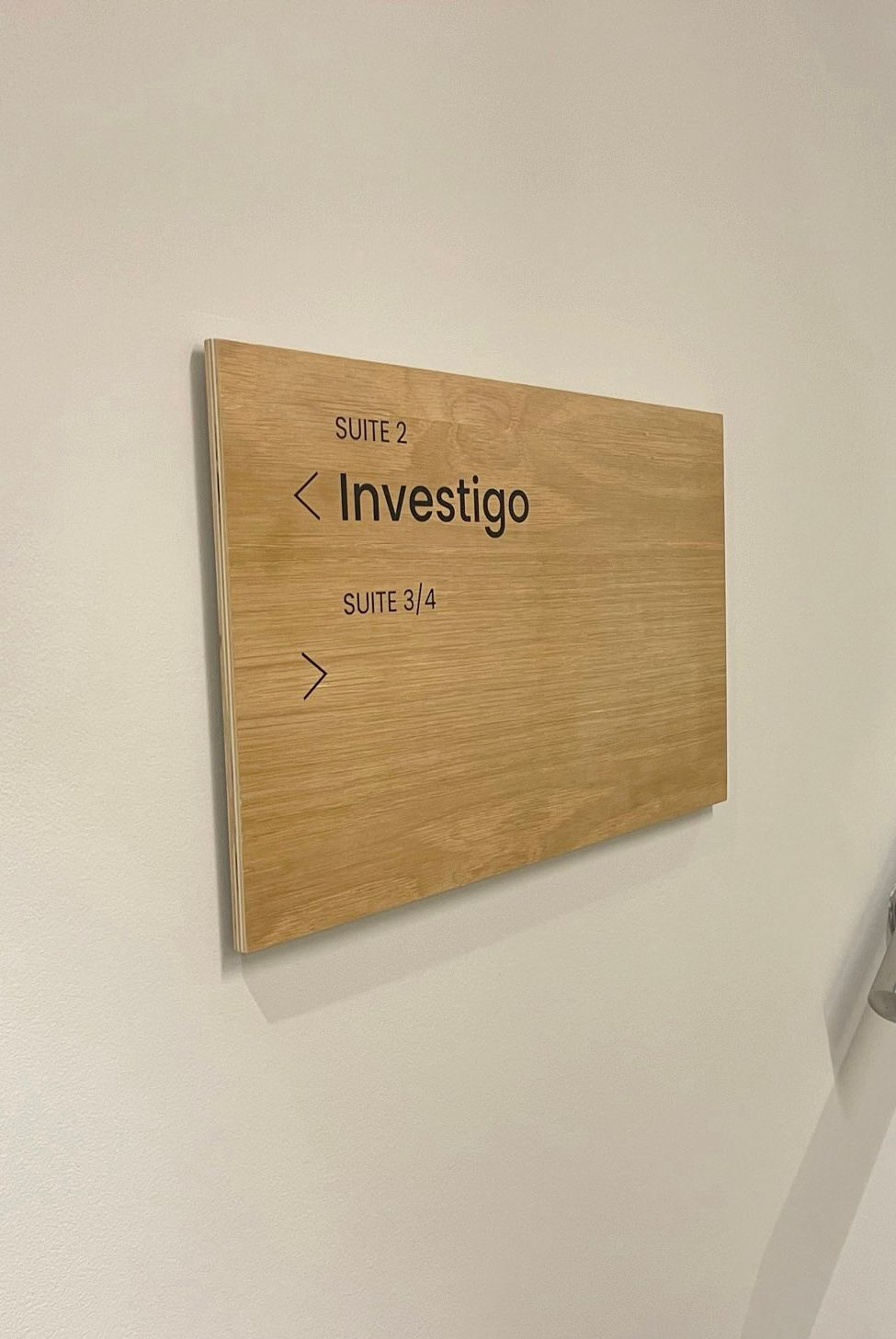
Clockhouse Court
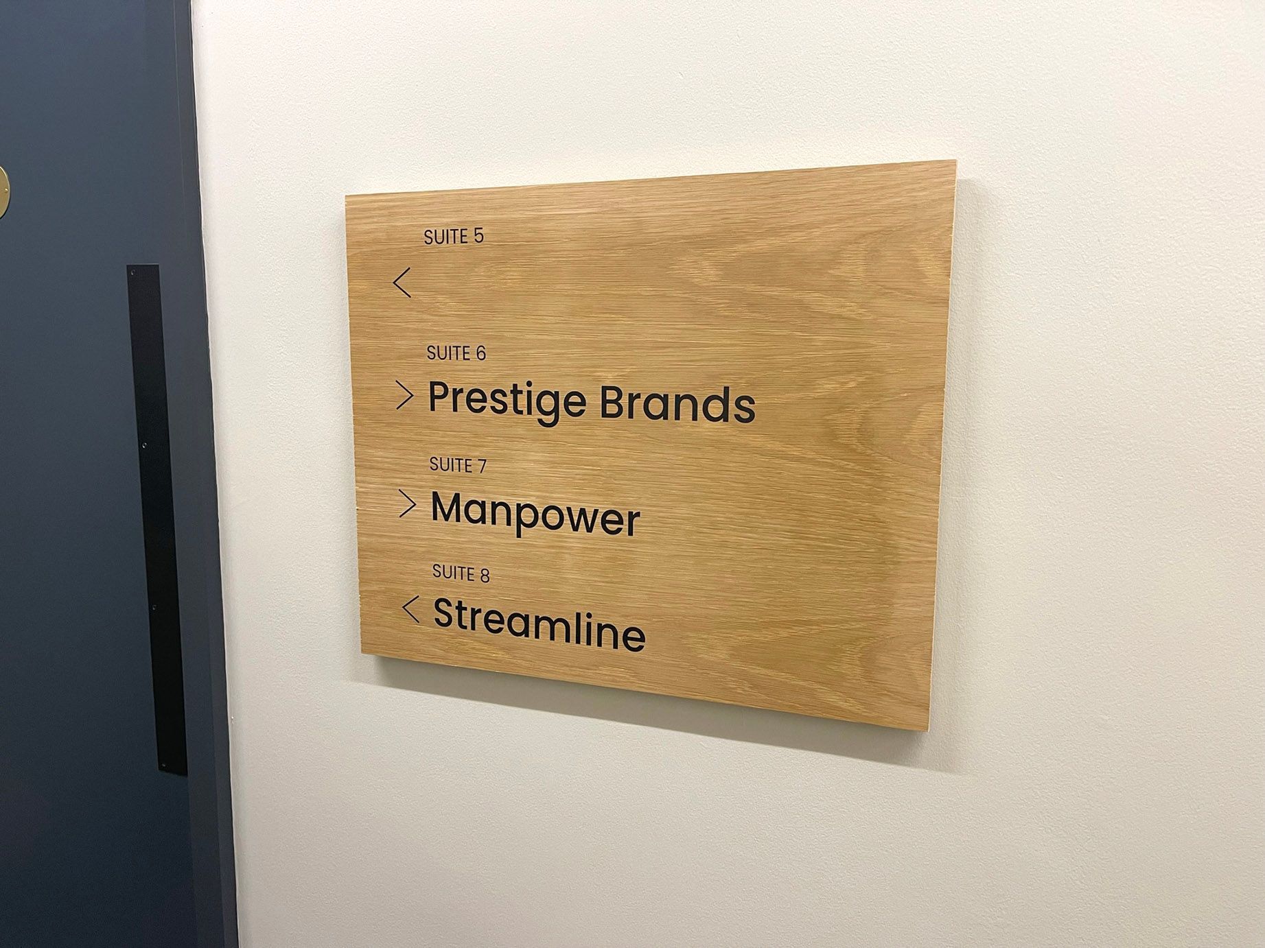
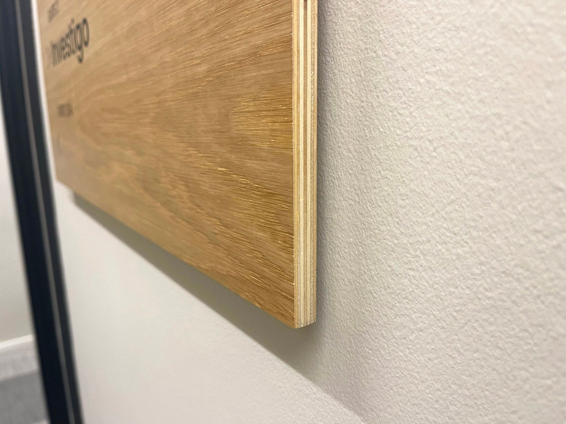
We were asked to provide wayfinding signs for the newly refurbished offices. Continuing the natural theme, we manufactured the signs out of oak veneered plywood, these were satin lacquered and all lettering/detail was completed using decal cut matt vinyl. We used button fixings on the reverse to allow for concealed fixings and show the signs floating off the wall. Positive comments started when we were installing and everyone was very pleased with the final results.
 Button
- Button
 Button
Slide title
Write your caption hereButton
 Button
 Button
 Button
Slide title
Write your caption hereButton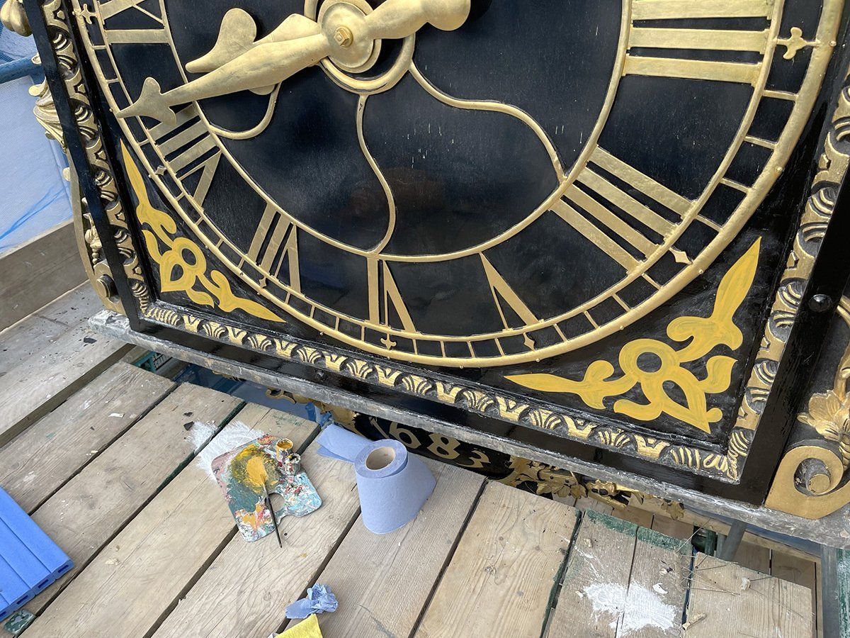
Slide title
Write your caption hereButton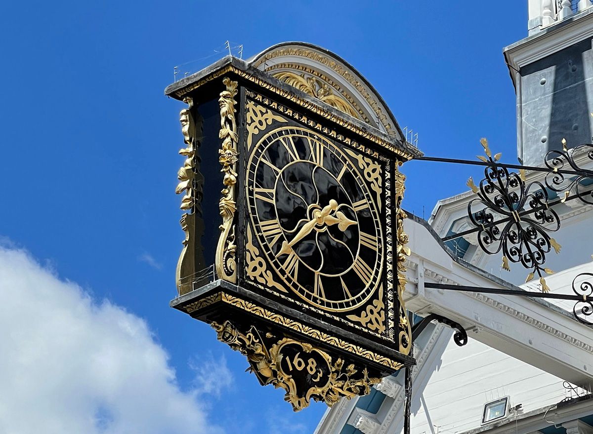
Slide title
Write your caption hereButton
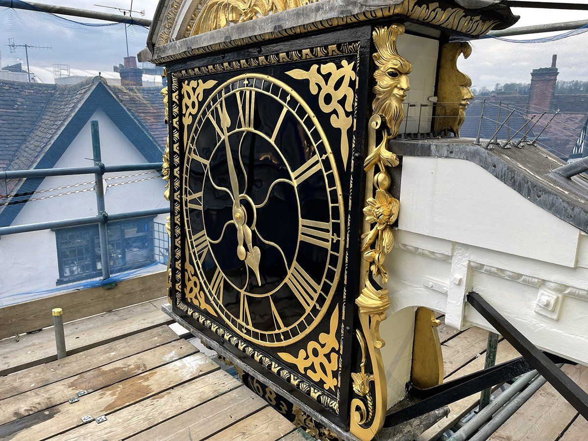
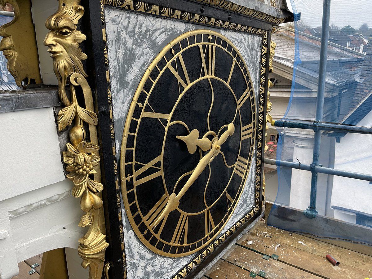
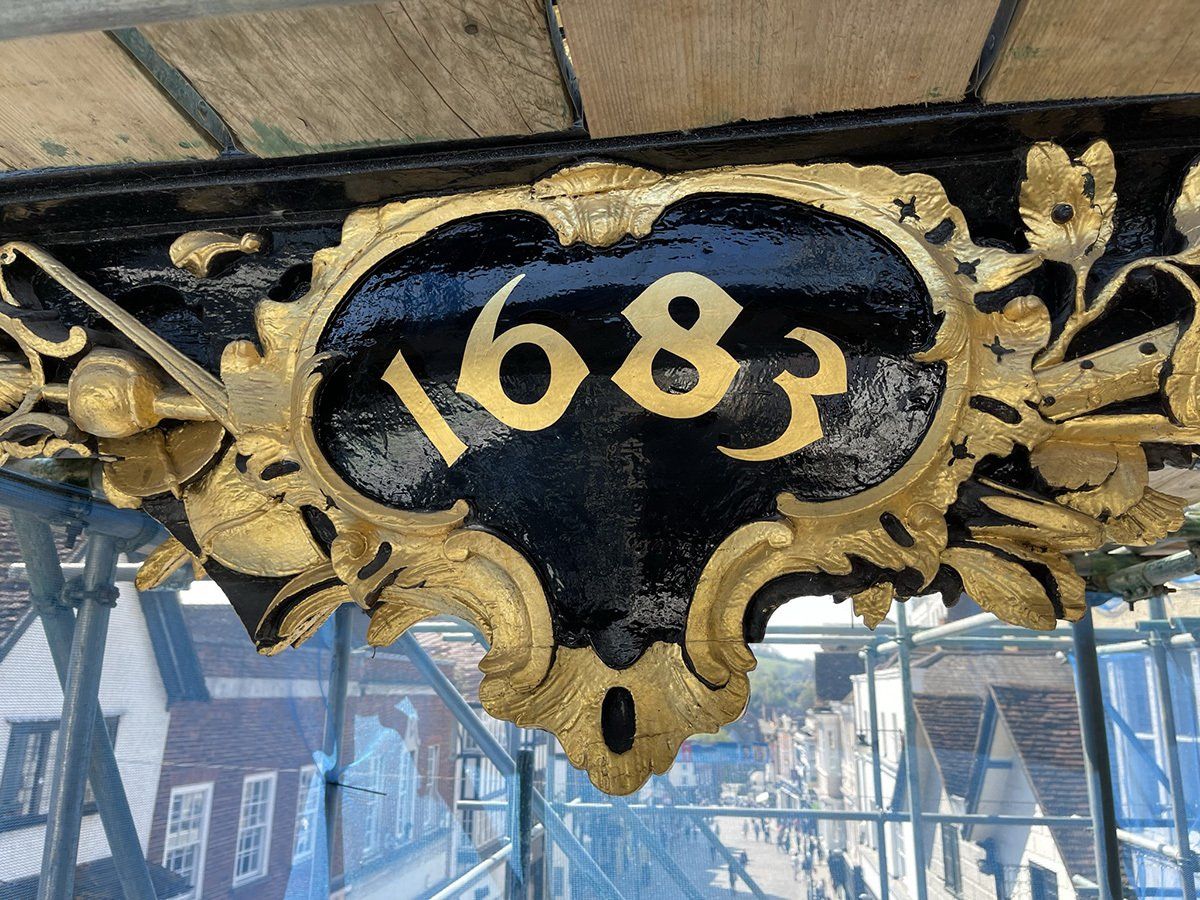
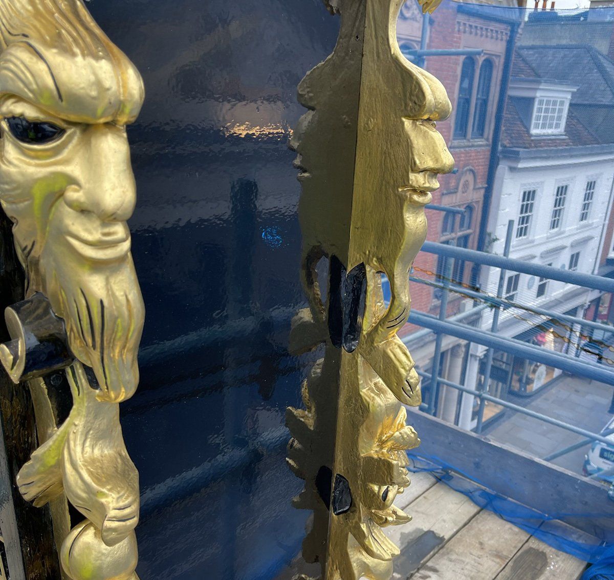
Guildford Guildhall
The Guildhall is a 16th century building of great historic interest and was formerly a courtroom and council chamber, and is still a thriving part of the local community. Earlier this year Ash Contracting Ltd were awarded the project to repaint the outside of the Guildhall and we were given the opportunity to quote for the gold leaf restoration on and around the clockface. We set to work taking drawings of any of the old, gilded designs and then started with the repainting. The designs were sign written and then gilded in 23 ¾ carat gold transfer leaf. The entire clock face was also repainted in a high gloss black finish to really enhance the gold leaf.
Whole Foods Market, Kensington
Working with the client for some years, we were asked to be involved in the update of the ground floor signage. Being the flagship store of their UK stores, the specification was beautifully thought out by their American design agency.
 Button
 Button
 Button
Slide title
Write your caption hereButton
Slide title
Write your caption hereButton
Slide title
Write your caption hereButton
Slide title
Write your caption hereButton
Slide title
Write your caption hereButton
Slide title
Write your caption hereButton
Whole Foods Market – Kensington Lower Ground Floor Signage Refresh
Working with the approved brief from SE retail in South Carolina, USA. Works consisted of 15mm acrylic lines and shapes spray painted in a gloss finish and to compliment these, 25mm thick acrylic letters finished in matt. All on bespoke locator fixings. Within the art deco shaped acrylic we hand painted the walls in Little Greene paint to introduce complimentary colours.
12No bespoke aluminium aisle signs were also supplied and installed with slide in/out sections to enable staff to move the produce and then the name with ease. 6No printed foamex wayfinding signs were also supplied and installed to allow the journey around the store easier to navigate.
 Button
 Button
 Button
Slide title
Write your caption hereButton
Slide title
Write your caption hereButton
Slide title
Write your caption hereButton
Slide title
Write your caption hereButton
Slide title
Write your caption hereButton
Slide title
Write your caption hereButton
Whole Foods Market – Kensington Lower Ground Floor Signage Refresh
Working with the approved brief from SE retail in South Carolina, USA. Works consisted of 15mm acrylic lines and shapes spray painted in a gloss finish and to compliment these, 25mm thick acrylic letters finished in matt. All on bespoke locator fixings. Within the art deco shaped acrylic we hand painted the walls in Little Greene paint to introduce complimentary colours.
12No bespoke aluminium aisle signs were also supplied and installed with slide in/out sections to enable staff to move the produce and then the name with ease. 6No printed foamex wayfinding signs were also supplied and installed to allow the journey around the store easier to navigate.
Bishop Wand School, Sunbury
To complete the refurbishment work and major updates to the school, it was time for a new sign. Our client had a very tired 80s sign and a new sign had to reflect the work undertaken and a more modern day design and use of materials.
A bespoke fabricated monolith was chosen in a size and finish to suit the new location and to eliminate car headlight reflection in the winter months. The client had a good eye for detail and chose to have recessed edges as well as a flat back to the sign. It was very well received by all staff and even the pupils taking photos before the installation was complete.
 Button
Slide title
Write your caption hereButton Button
Slide title
Write your caption hereButton
Bishop Wand School, Sunbury
To complete the refurbishment work and major updates to the school, it was time for a new sign. Our client had a very tired 80s sign and a new sign had to reflect the work undertaken and a more modern day design and use of materials.
A bespoke fabricated monolith was chosen in a size and finish to suit the new location and to eliminate car headlight reflection in the winter months. The client had a good eye for detail and chose to have recessed edges as well as a flat back to the sign. It was very well received by all staff and even the pupils taking photos before the installation was complete.
 Button
Slide title
Write your caption hereButton Button
Slide title
Write your caption hereButton
 Button
 Button
 Button
Slide title
Write your caption hereButton
64 Goodge Street
Working with design agency Everything in Between and the Restaurant owners Woodhead Restaurant Group we were asked to produce an aged looking sign to reflect the aesthetics of the building. There was a large use of aged brass within the restaurant and we brought this effect outside with a slight modern twist. Using our CNC machine, we cut the 64 shape out of 10mm acrylic and distress sprayed it to look like aged brass. All the detail was then gold leaf gilded using 23.75 ct gold leaf.
“Thank you for all your beautiful work; we're so pleased with how it has turned out.”
Hugo Schlesinger
Head of Business Development
 Button
 Button
 Button
Slide title
Write your caption hereButton
64 Goodge Street
Working with design agency Everything in Between and the Restaurant owners Woodhead Restaurant Group we were asked to produce an aged looking sign to reflect the aesthetics of the building. There was a large use of aged brass within the restaurant and we brought this effect outside with a slight modern twist. Using our CNC machine, we cut the 64 shape out of 10mm acrylic and distress sprayed it to look like aged brass. All the detail was then gold leaf gilded using 23.75 ct gold leaf.
“Thank you for all your beautiful work; we're so pleased with how it has turned out.”
Hugo Schlesinger
Head of Business Development
Clockhouse Court
We were asked to provide wayfinding signs for the newly refurbished offices. Continuing the natural theme, we manufactured the signs out of oak veneered plywood, these were satin lacquered and all lettering/detail was completed using decal cut matt vinyl. We used button fixings on the reverse to allow for concealed fixings and show the signs floating off the wall. Positive comments started when we were installing and everyone was very pleased with the final results.
 Button
Slide title
Write your caption hereButton- Button

Slide title
Write your caption hereButton
Clockhouse Court
We were asked to provide wayfinding signs for the newly refurbished offices. Continuing the natural theme, we manufactured the signs out of oak veneered plywood, these were satin lacquered and all lettering/detail was completed using decal cut matt vinyl. We used button fixings on the reverse to allow for concealed fixings and show the signs floating off the wall. Positive comments started when we were installing and everyone was very pleased with the final results.
 Button
Slide title
Write your caption hereButton- Button

Slide title
Write your caption hereButton
 Button
 Button
 Button
Slide title
Write your caption hereButton
Slide title
Write your caption hereButton
Slide title
Write your caption hereButton
Guildford Guildhall
The Guildhall is a 16th century building of great historic interest and was formerly a courtroom and council chamber, and is still a thriving part of the local community. Earlier this year Ash Contracting Ltd were awarded the project to repaint the outside of the Guildhall and we were given the opportunity to quote for the gold leaf restoration on and around the clockface. We set to work taking drawings of any of the old, gilded designs and then started with the repainting. The designs were sign written and then gilded in 23 ¾ carat gold transfer leaf. The entire clock face was also repainted in a high gloss black finish to really enhance the gold leaf.
 Button
 Button
 Button
Slide title
Write your caption hereButton
Slide title
Write your caption hereButton
Slide title
Write your caption hereButton
Guildford Guildhall
The Guildhall is a 16th century building of great historic interest and was formerly a courtroom and council chamber, and is still a thriving part of the local community. Earlier this year Ash Contracting Ltd were awarded the project to repaint the outside of the Guildhall and we were given the opportunity to quote for the gold leaf restoration on and around the clockface. We set to work taking drawings of any of the old, gilded designs and then started with the repainting. The designs were sign written and then gilded in 23 ¾ carat gold transfer leaf. The entire clock face was also repainted in a high gloss black finish to really enhance the gold leaf.
Whole Foods Market, Kensington
Working with the client for some years, we were asked to be involved in the update of the ground floor signage. Being the flagship store of their UK stores, the specification was beautifully thought out by their American design agency.
Whole Foods Market, Kensington
Working with the client for some years, we were asked to be involved in the update of the ground floor signage. Being the flagship store of their UK stores, the specification was beautifully thought out by their American design agency.
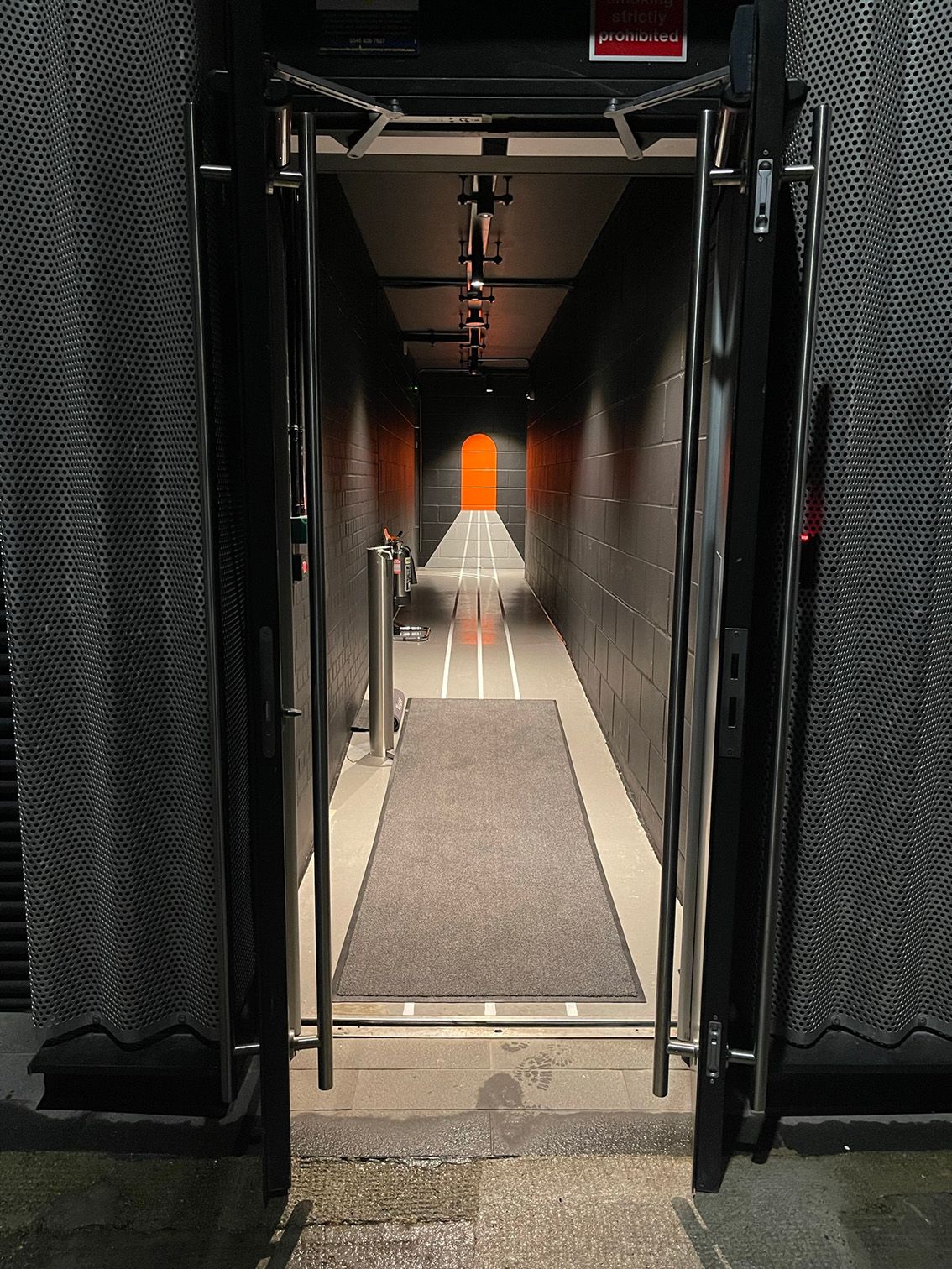
Rolling Stock Yard
Working with design agency, Mammal, we were asked to paint lines in the Rolling Stock Yard bike store. The idea behind the lines was inspired from the area’s pioneering railway that started with the nineteenth century Great Northern Railway. All lines where hand painted using specialist floor marking paint and emulsion on the walls and working over 3 nights we completed on time with great results.
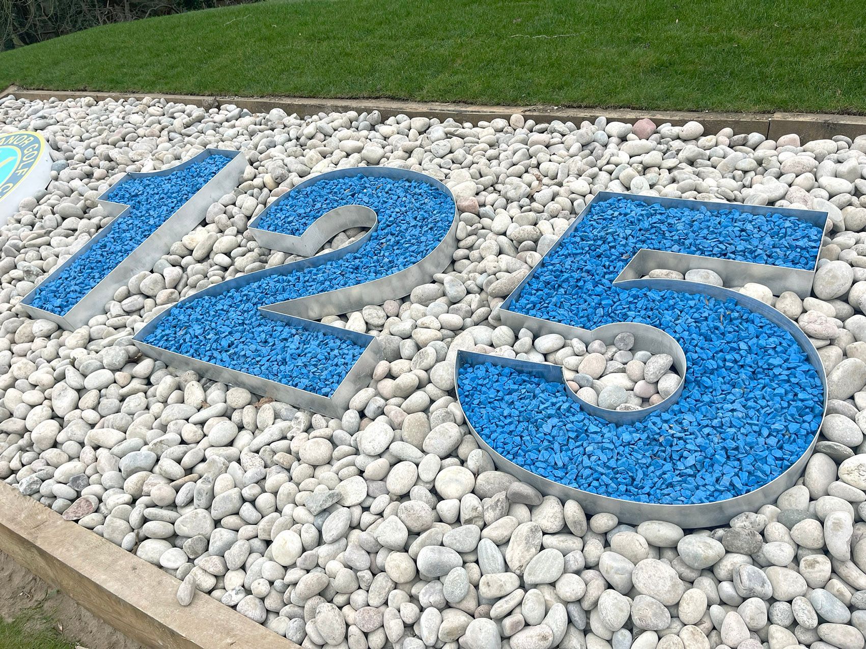
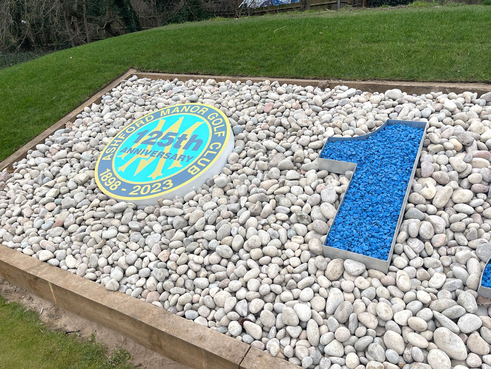
Ashford Manor Golf Club
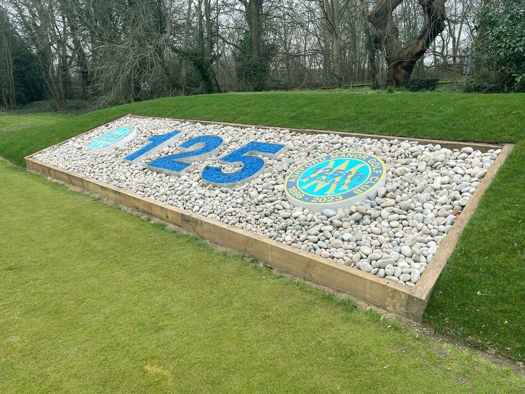
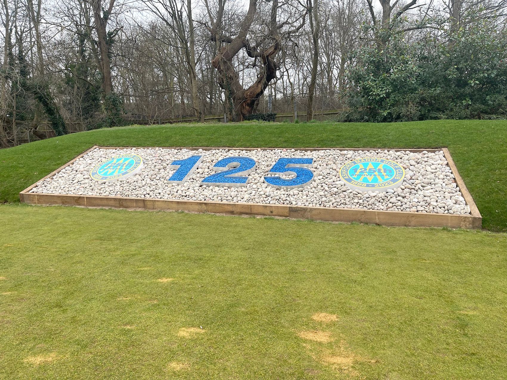
To help the club celebrate their 125th anniversary, as well as designing their logo we supplied some large 3-dimensional numbers for all the golfers to see on the first tee. These were open faced numbers 1m tall, powder coated and filled with blue shingle sourced from Glasgow. To compliment the numbers, we also supplied some 1m diameter roundels with digital prints of the anniversary logo. All the members loved the new signage and the way it was all put together.
“I have used Signmode on a number of bespoke projects and every time they exceed my expectations. Great communications, Competitive pricing and real eye for detail. My first choice for signage in the local area.”
Mike O’Connell CCM, General Manager
Ashford Manor Golf Club
- Button
 Button
 Button
Slide title
Write your caption hereButton
 Button
Slide title
Write your caption hereButton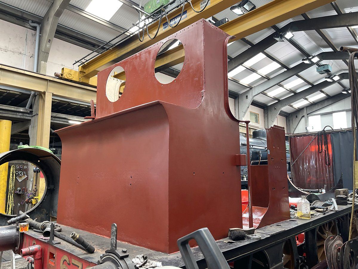
Slide title
Write your caption hereButton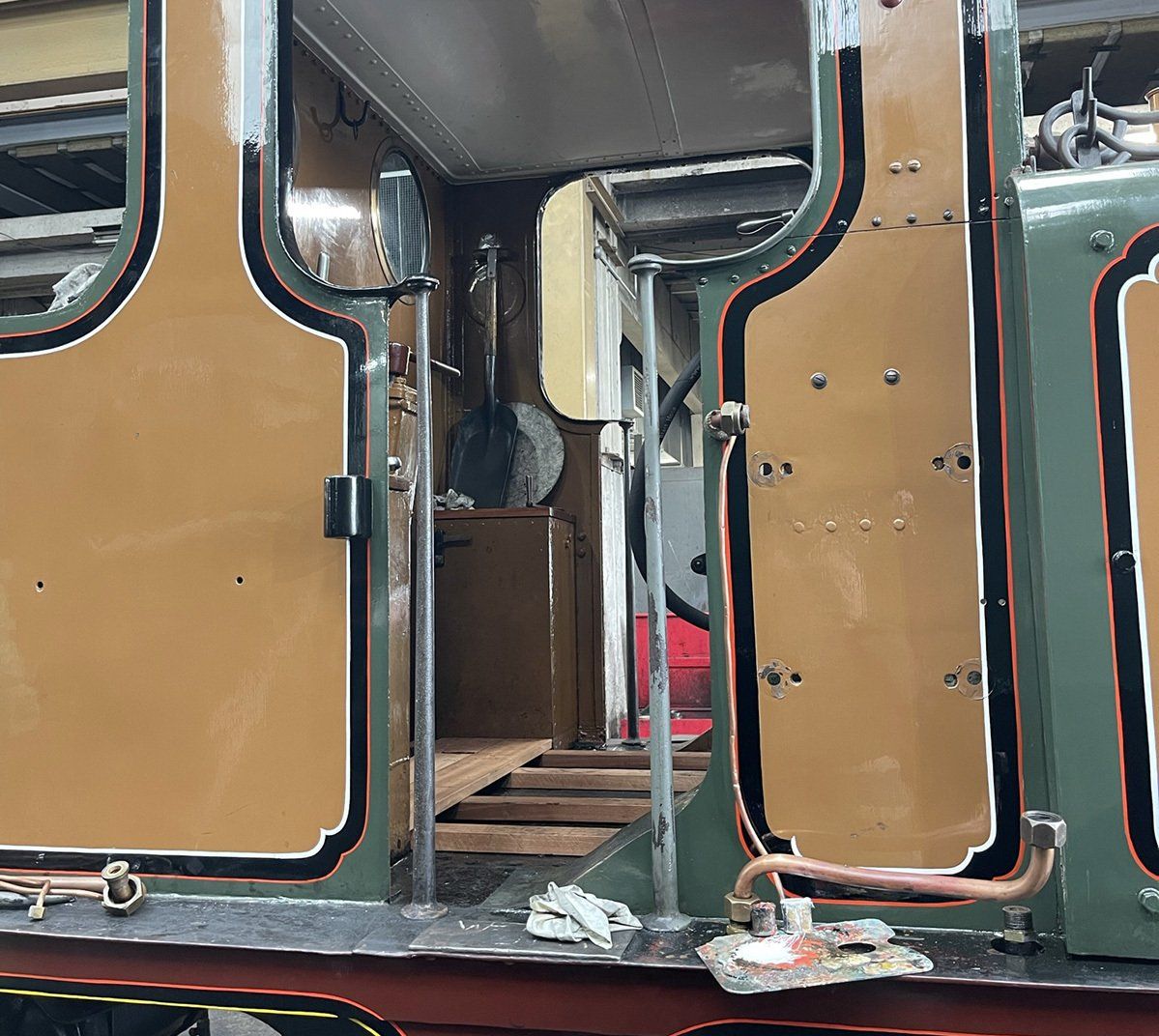
Slide title
Write your caption hereButton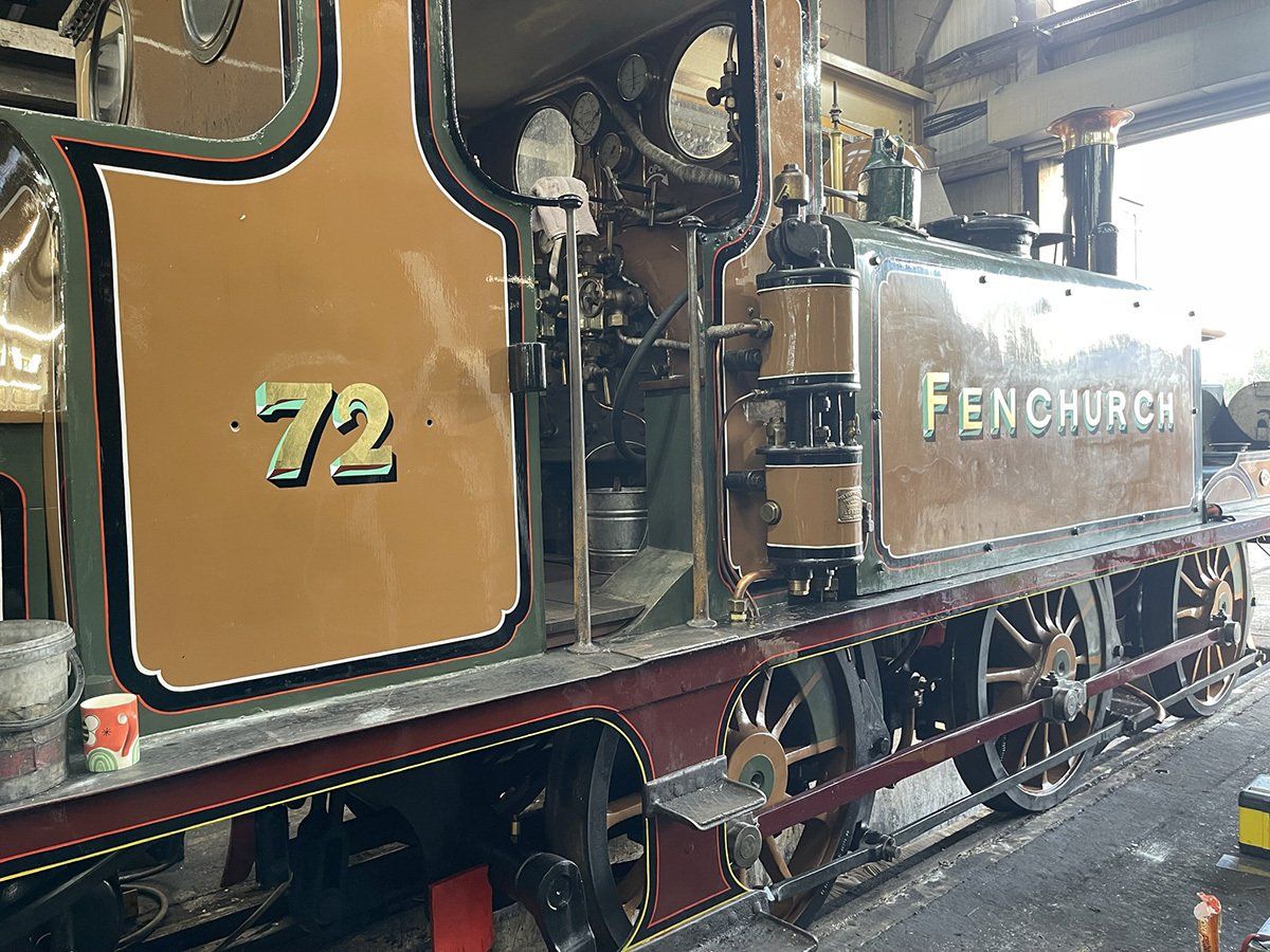
Slide title
Write your caption hereButton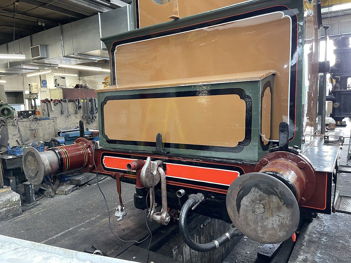
Slide title
Write your caption hereButton
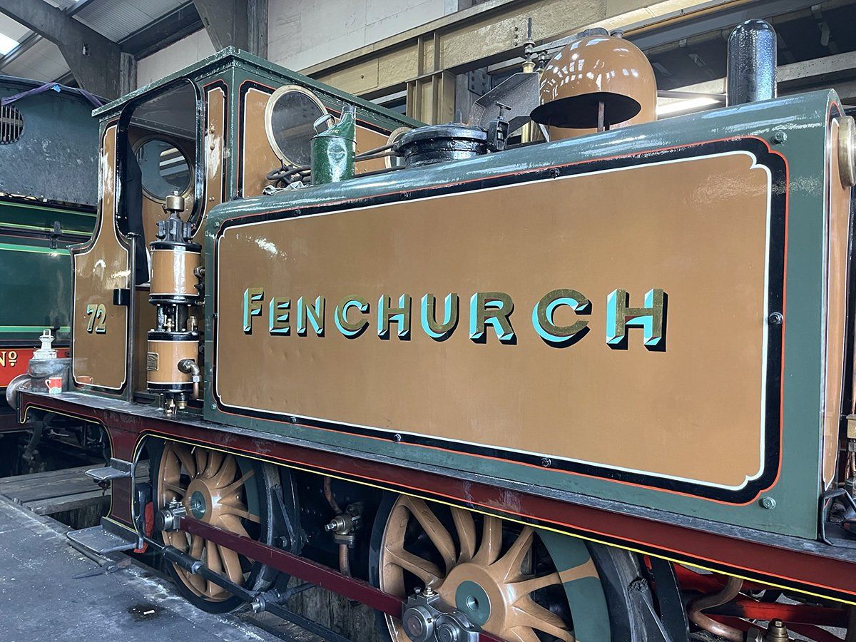
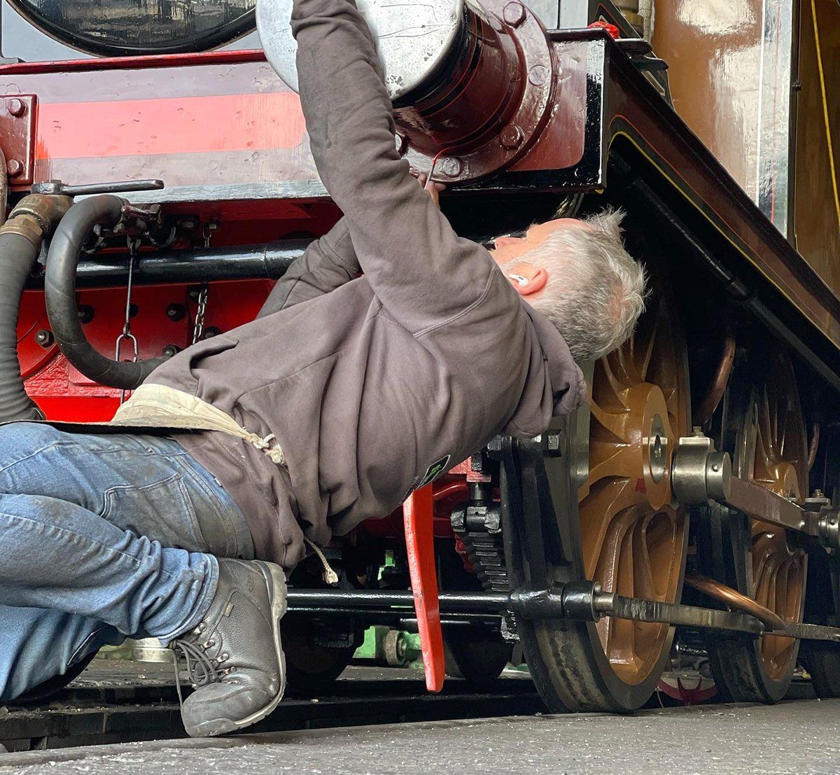
Bluebell Railway, Fenchurch
An enquiry came out of the blue from Bluebell Railway needing a sign writer to work on one of their steam trains. We paid them a visit and discovered it was an entire train they wanted coach painted and sign written. Fenchurch, over 150 years old was in their sheds for a complete overhaul including a rebuild of the boiler. We hand painted the train from bare metal up to the third coat of gloss, having lined all the panels and tanks, the Fenchurch name was sign written and gilded on the water tanks. It was an absolute honour to work on this piece of history.
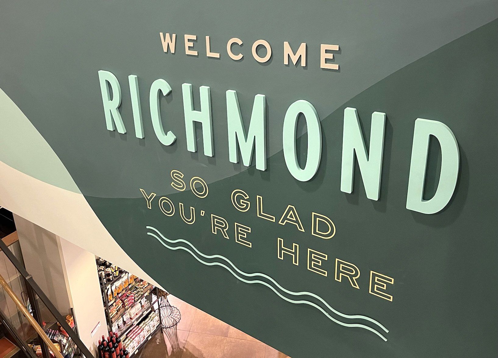
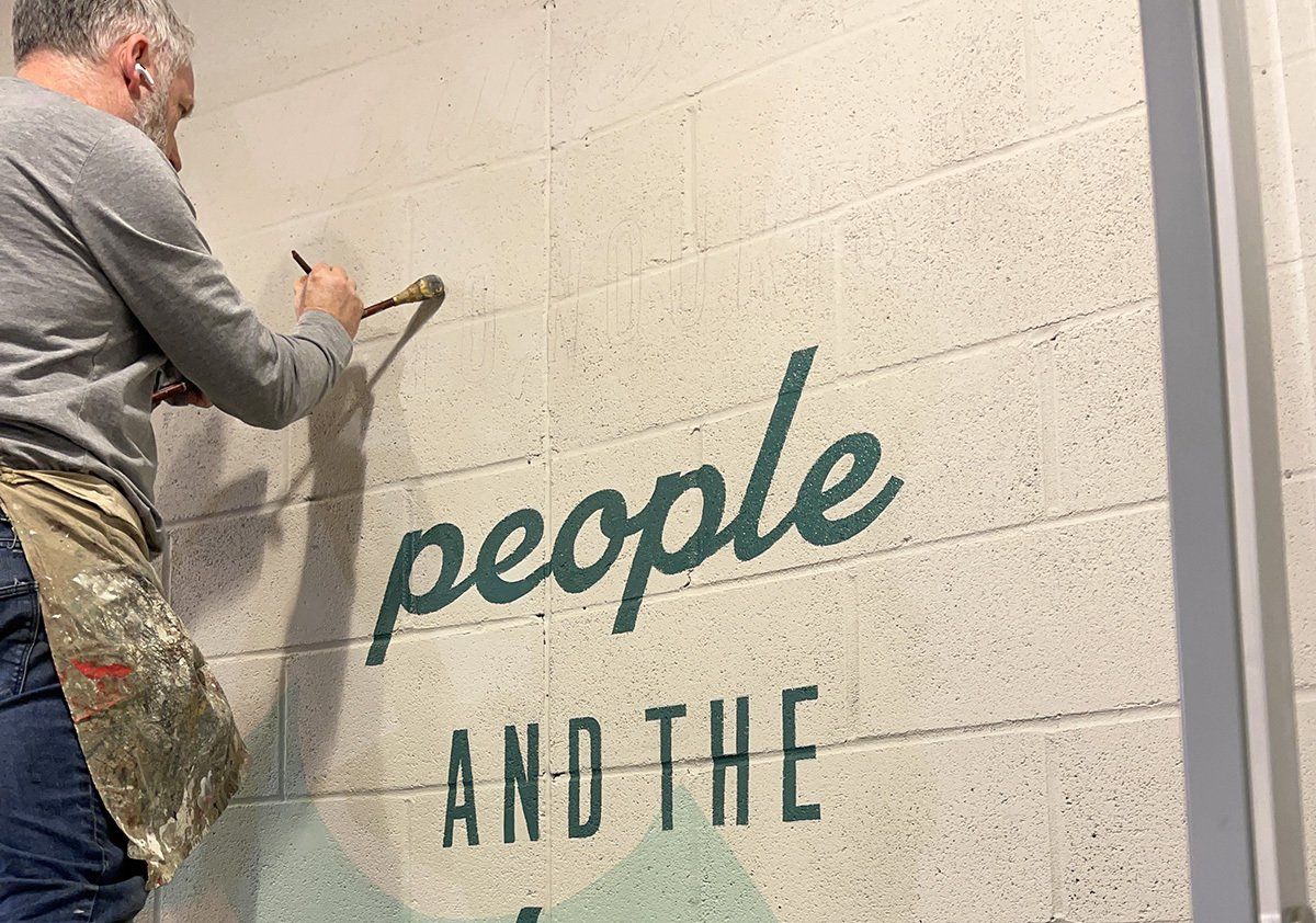
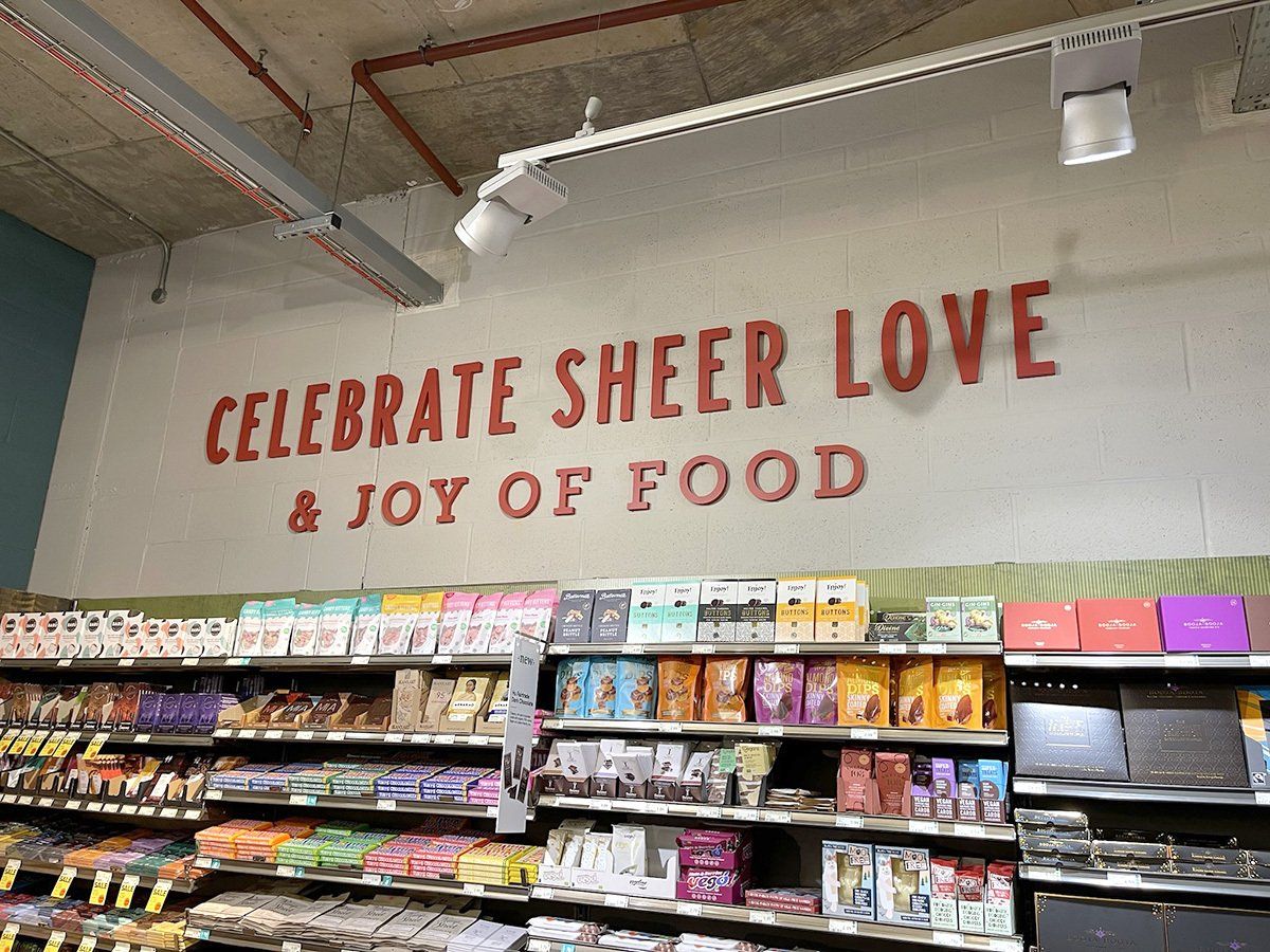
Whole Foods Market, Richmond Store Decor Refresh
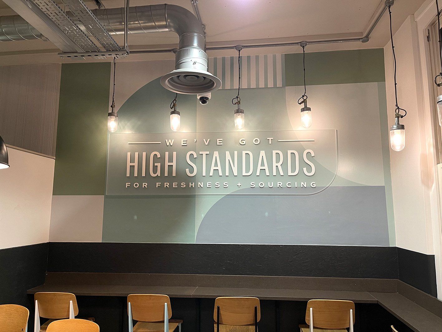
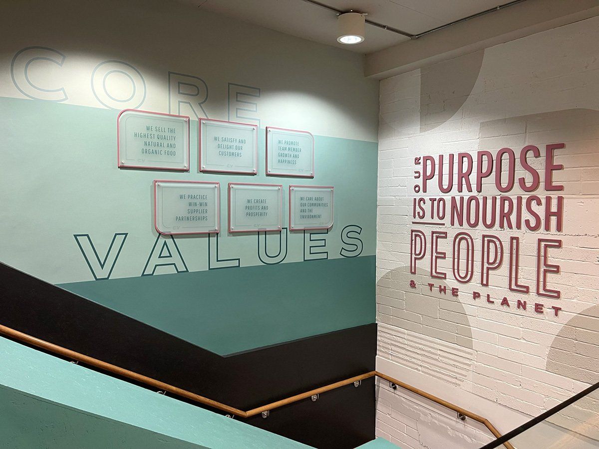
Continuing their bespoke creative signage scheme design – Whole Foods appointed us to supply and install the internal signage of the 2 floors of their Richmond store. Work consisted of hand painted wall designs, fret cut and painted acrylic letters, LED lightboxes and screen-printed acrylic panels. Installation was out of hours and completed over a 3-week period and was greatly received both here in the UK and the USA where they have over 500 stores.
 Button
 Button
 Button
Slide title
Write your caption hereButton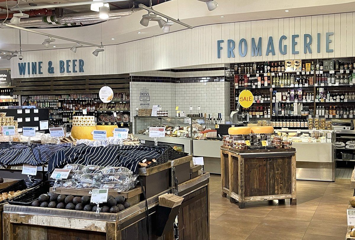
Slide title
Write your caption hereButton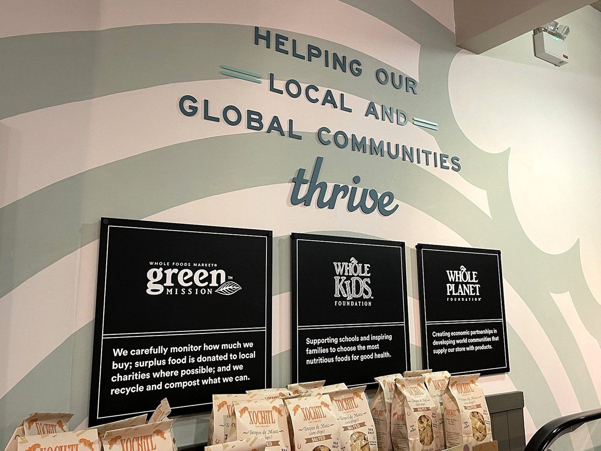
Slide title
Write your caption hereButton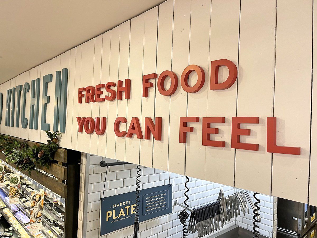
Slide title
Write your caption hereButton
Slide title
Write your caption hereButton- Button
 Button
 Button
Slide title
Write your caption hereButton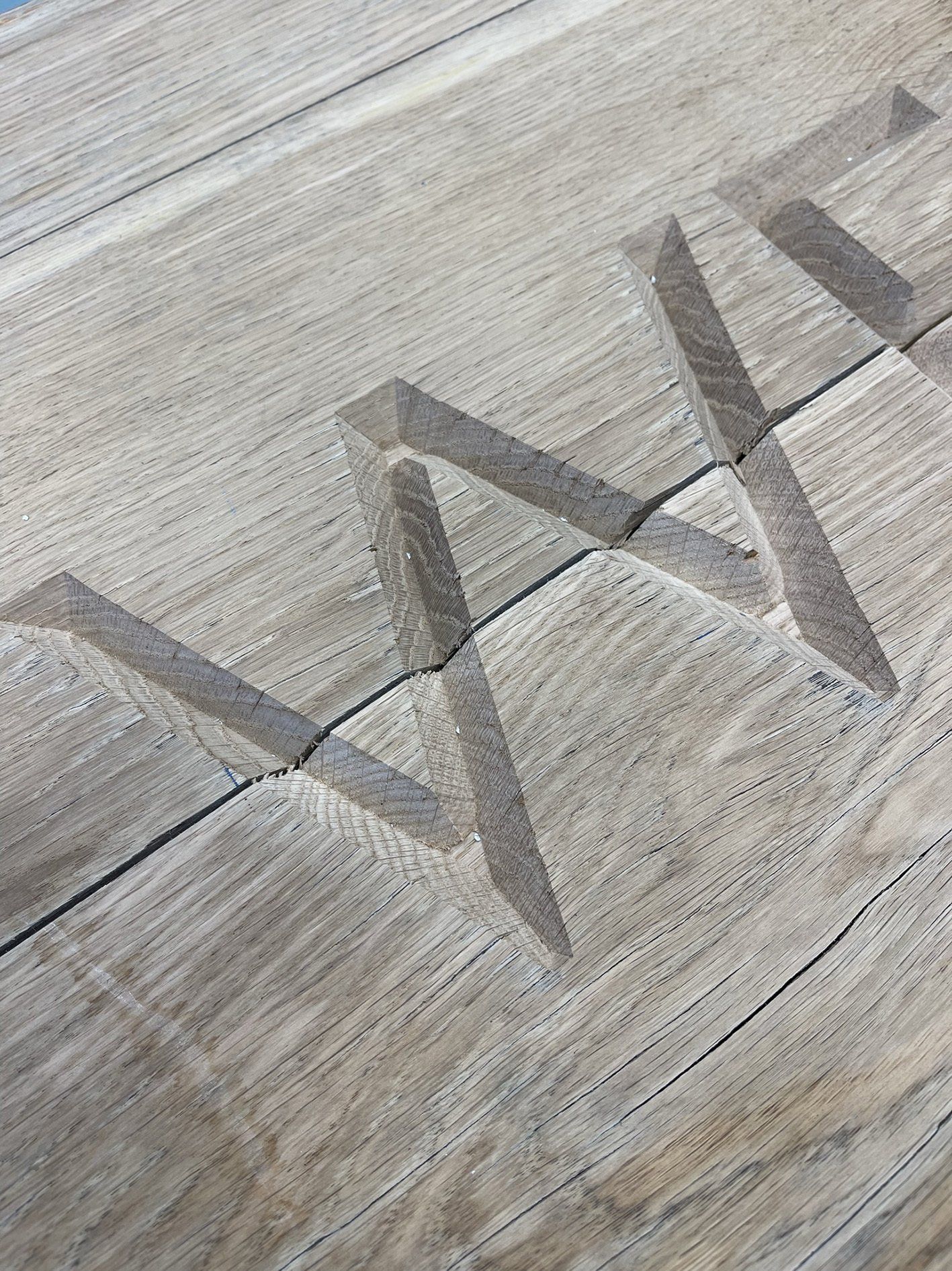
Slide title
Write your caption hereButton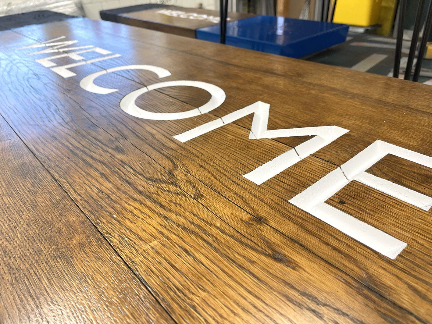
Slide title
Write your caption hereButton
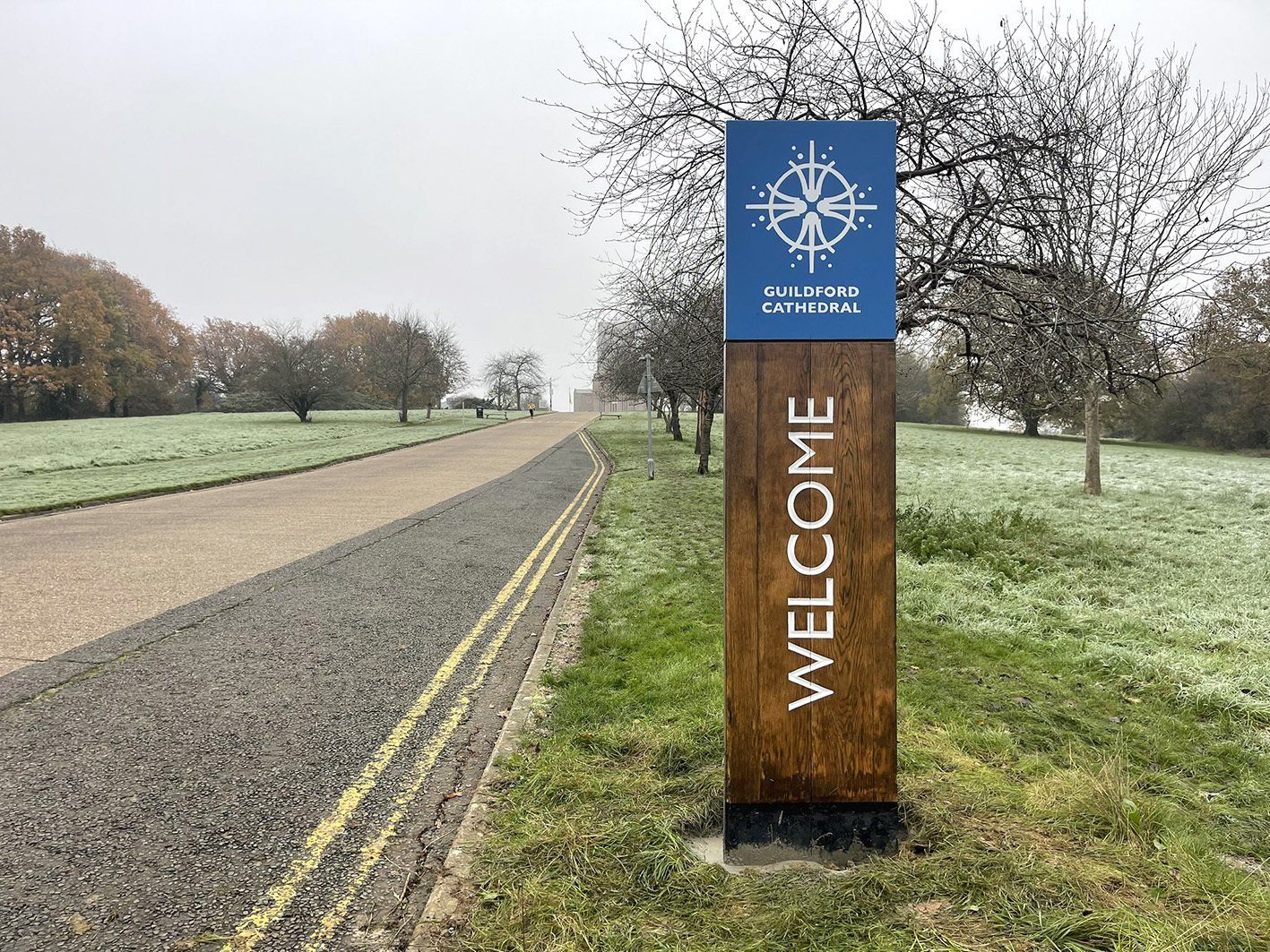
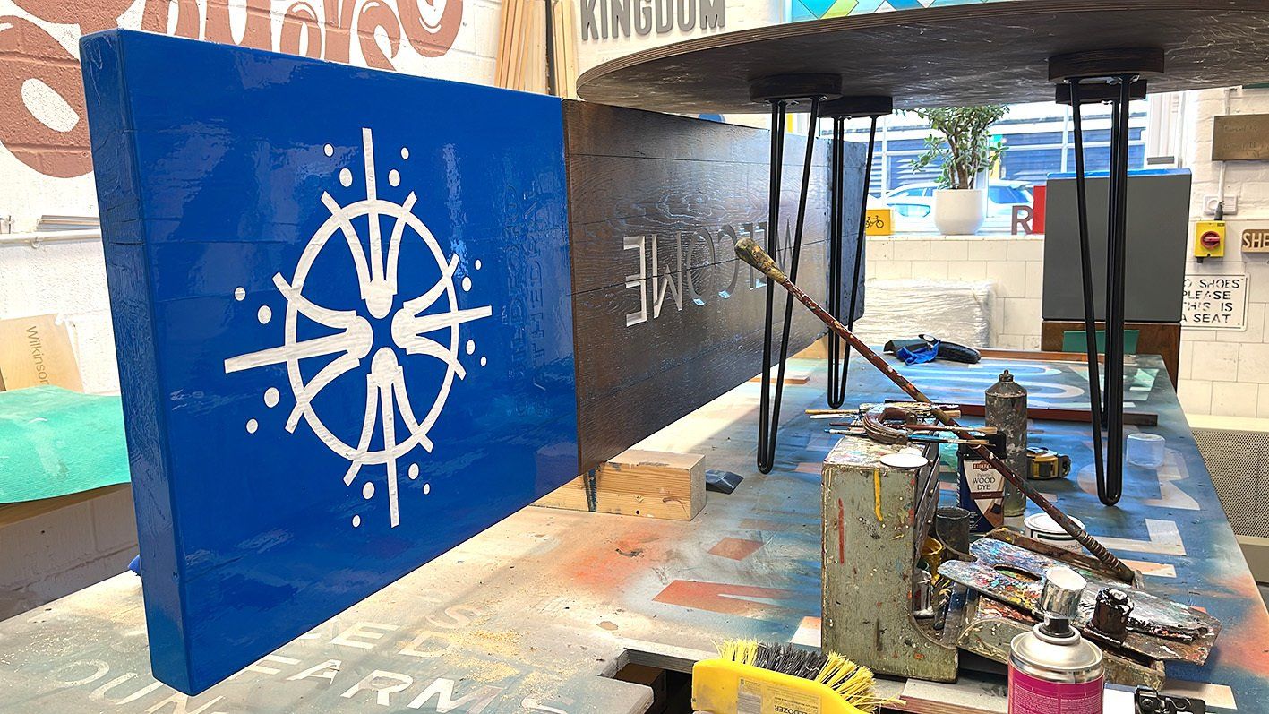
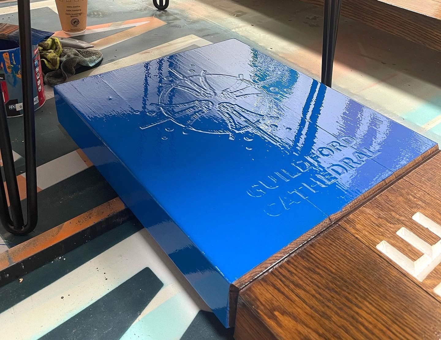
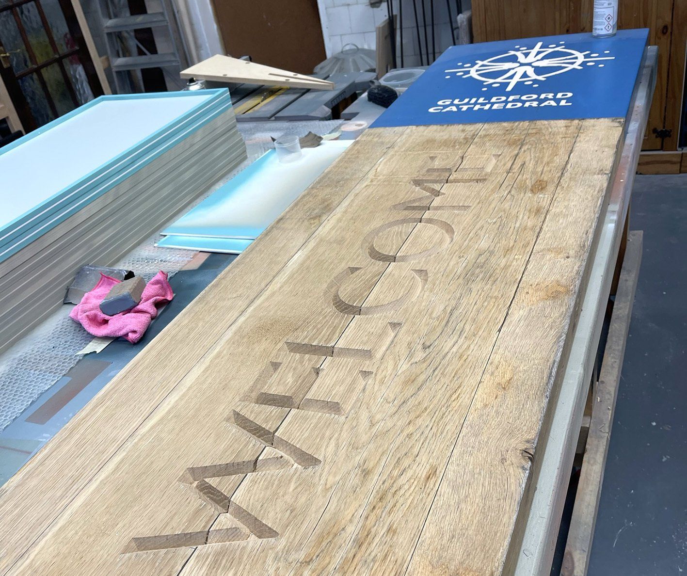
Guildford Cathedral
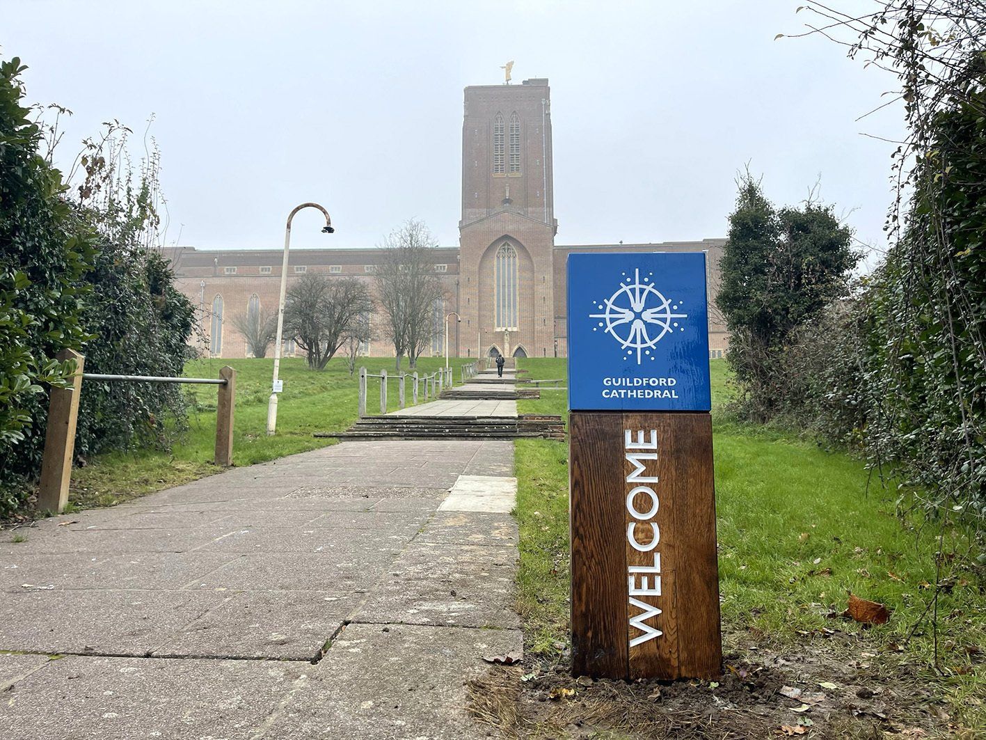
The old main external signs, were in dire need need of restoration, so we were selected to take on this project. Storing the signs for 6 months in our workshop to dry them out, we sanded down the painted areas and v carved the new welcome lettering. The timber was then stained and osmo oiled and the lettering infilled in white. The top section was prepared, high gloss finished and then lettering in-filled in white. Installation was just in time for the Cathedrals Carol concert which played a big part in the visitor experience.
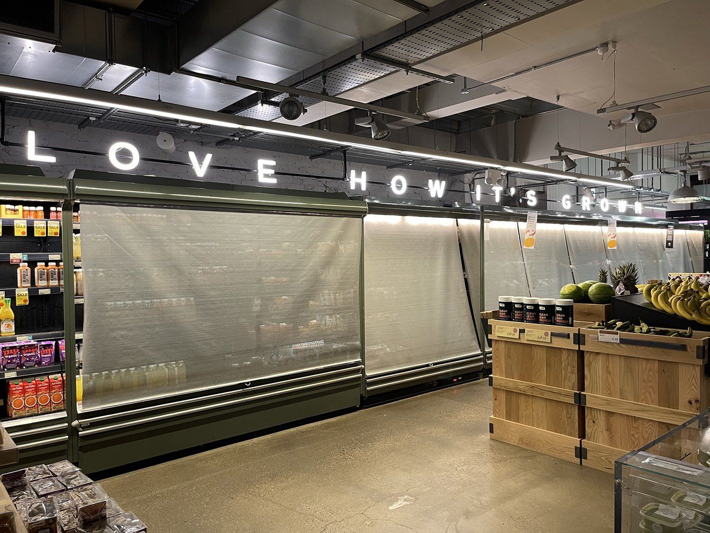
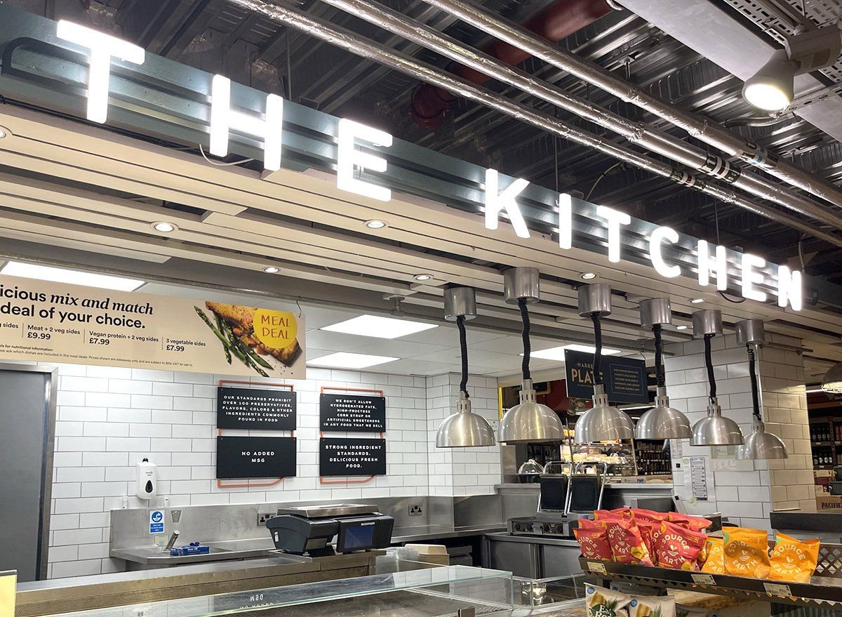
Whole Foods Market, Fulham Store Refresh
We jumped at the chance to work on our second Whole Foods store in a year. With regular communications and discussions with their appointed American Design Agency, we set to work on their internal signage over their 2 floors. Work consisted of LED illuminated lettering and lines, painted acrylic panels and letters, hand painted wall designs, bespoke acrylic fascias and digitally printed wall paper. Feedback has been very positive from the UK and the USA.
 Button
 Button
Slide title
Write your caption hereButton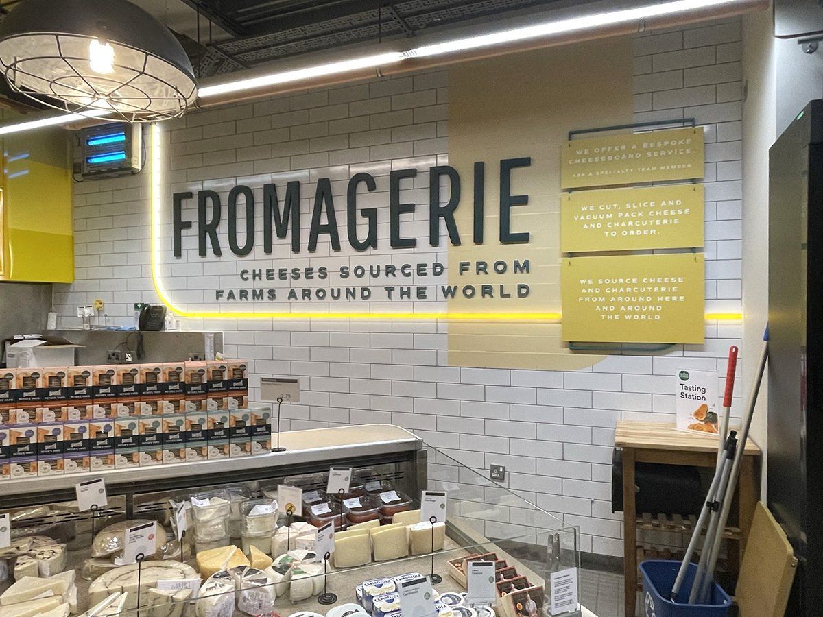
Slide title
Write your caption hereButton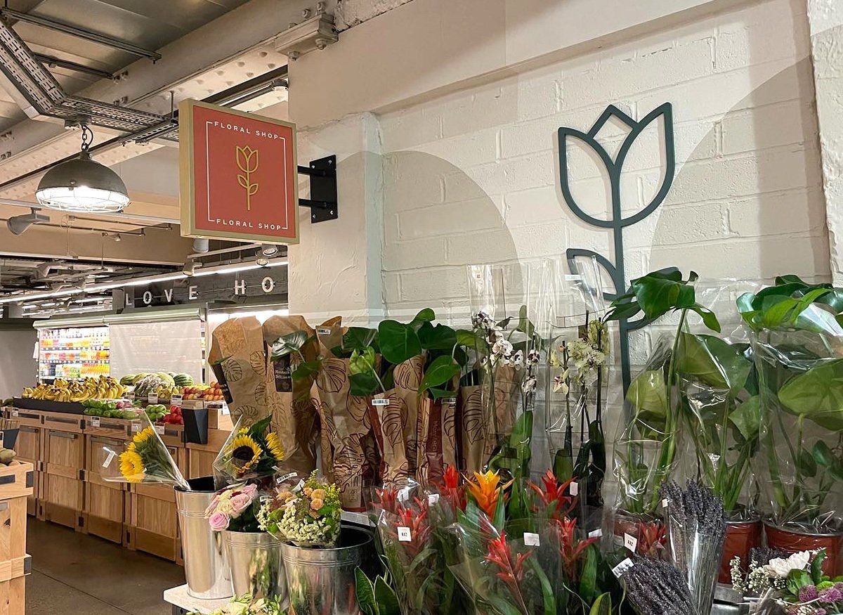 Button
Slide title
Write your caption hereButton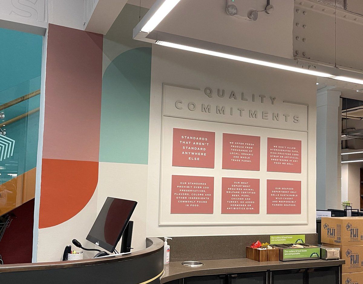
Slide title
Write your caption hereButton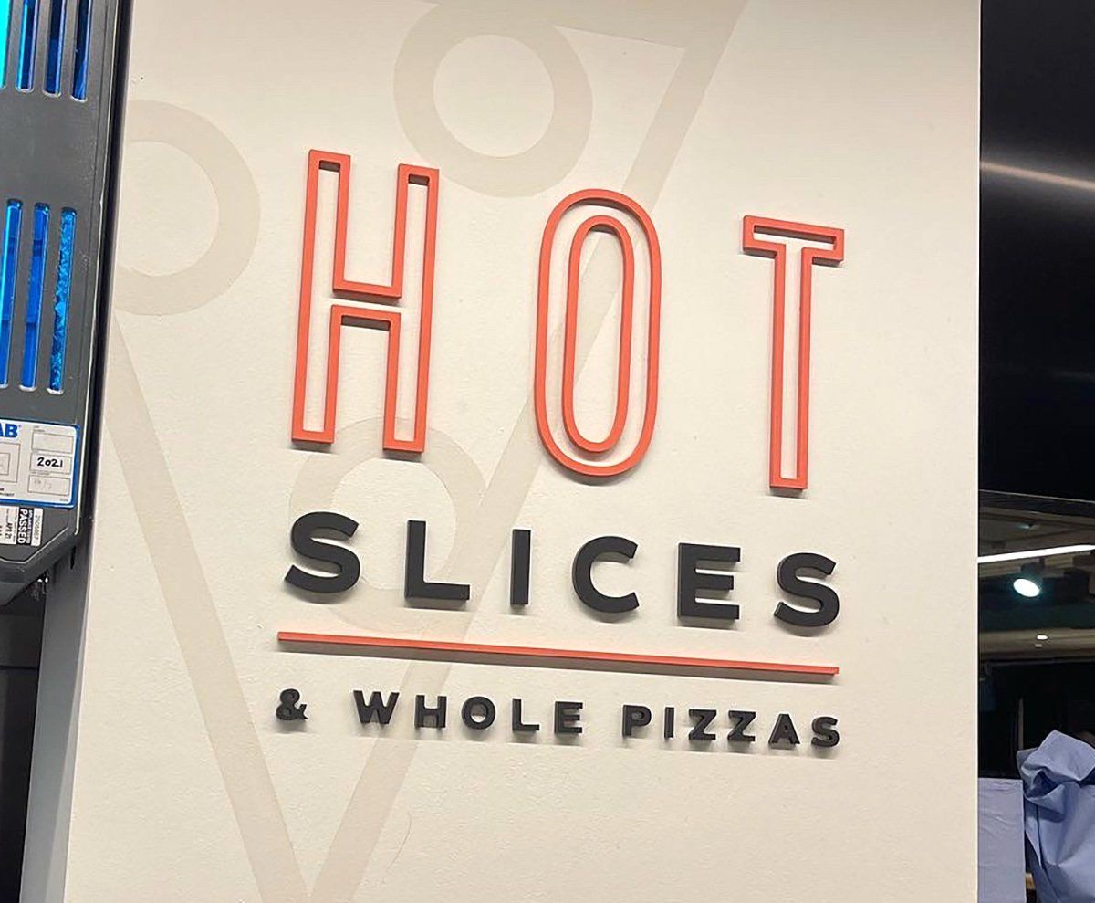
Slide title
Write your caption hereButton
Rolling Stock Yard
Working with design agency, Mammal, we were asked to paint lines in the Rolling Stock Yard bike store. The idea behind the lines was inspired from the area’s pioneering railway that started with the nineteenth century Great Northern Railway. All lines where hand painted using specialist floor marking paint and emulsion on the walls and working over 3 nights we completed on time with great results.
Ashford Manor Golf Club
To help the club celebrate their 125th anniversary, as well as designing their logo we supplied some large 3-dimensional numbers for all the golfers to see on the first tee. These were open faced numbers 1m tall, powder coated and filled with blue shingle sourced from Glasgow. To compliment the numbers, we also supplied some 1m diameter roundels with digital prints of the anniversary logo. All the members loved the new signage and the way it was all put together
“I have used Signmode on a number of bespoke projects and every time they exceed my expectations. Great communications, Competitive pricing and real eye for detail. My first choice for signage in the local area.”
Mike O’Connell CCM, General Manager
Ashford Manor Golf Club
- Button

Slide title
Write your caption hereButton Button
Slide title
Write your caption hereButton
Ashford Manor Golf Club
To help the club celebrate their 125th anniversary, as well as designing their logo we supplied some large 3-dimensional numbers for all the golfers to see on the first tee. These were open faced numbers 1m tall, powder coated and filled with blue shingle sourced from Glasgow. To compliment the numbers, we also supplied some 1m diameter roundels with digital prints of the anniversary logo. All the members loved the new signage and the way it was all put together
“I have used Signmode on a number of bespoke projects and every time they exceed my expectations. Great communications, Competitive pricing and real eye for detail. My first choice for signage in the local area.”
Mike O’Connell CCM, General Manager
Ashford Manor Golf Club
- Button

Slide title
Write your caption hereButton Button
Slide title
Write your caption hereButton
 Button
Slide title
Write your caption hereButton
Slide title
Write your caption hereButton
Slide title
Write your caption hereButton
Slide title
Write your caption hereButton
Slide title
Write your caption hereButton
Bluebell Railway, Fenchurch
An enquiry came out of the blue from Bluebell Railway needing a sign writer to work on one of their steam trains. We paid them a visit and discovered it was an entire train they wanted coach painted and sign written. Fenchurch, over 150 years old was in their sheds for a complete overhaul including a rebuild of the boiler. We hand painted the train from bare metal up to the third coat of gloss, having lined all the panels and tanks, the Fenchurch name was sign written and gilded on the water tanks. It was an absolute honour to work on this piece of history.
 Button
Slide title
Write your caption hereButton
Slide title
Write your caption hereButton
Slide title
Write your caption hereButton
Slide title
Write your caption hereButton
Slide title
Write your caption hereButton
Bluebell Railway, Fenchurch
An enquiry came out of the blue from Bluebell Railway needing a sign writer to work on one of their steam trains. We paid them a visit and discovered it was an entire train they wanted coach painted and sign written. Fenchurch, over 150 years old was in their sheds for a complete overhaul including a rebuild of the boiler. We hand painted the train from bare metal up to the third coat of gloss, having lined all the panels and tanks, the Fenchurch name was sign written and gilded on the water tanks. It was an absolute honour to work on this piece of history.
Whole Foods Market, Richmond Store Decor Refresh
Continuing their bespoke creative signage scheme design – Whole Foods appointed us to supply and install the internal signage of the 2 floors of their Richmond store. Work consisted of hand painted wall designs, fret cut and painted acrylic letters, LED lightboxes and screen-printed acrylic panels. Installation was out of hours and completed over a 3-week period and was greatly received both here in the UK and the USA where they have over 500 stores.
 Button
Slide title
Write your caption hereButton Button
Slide title
Write your caption hereButton
Slide title
Write your caption hereButton
Slide title
Write your caption hereButton
Slide title
Write your caption hereButton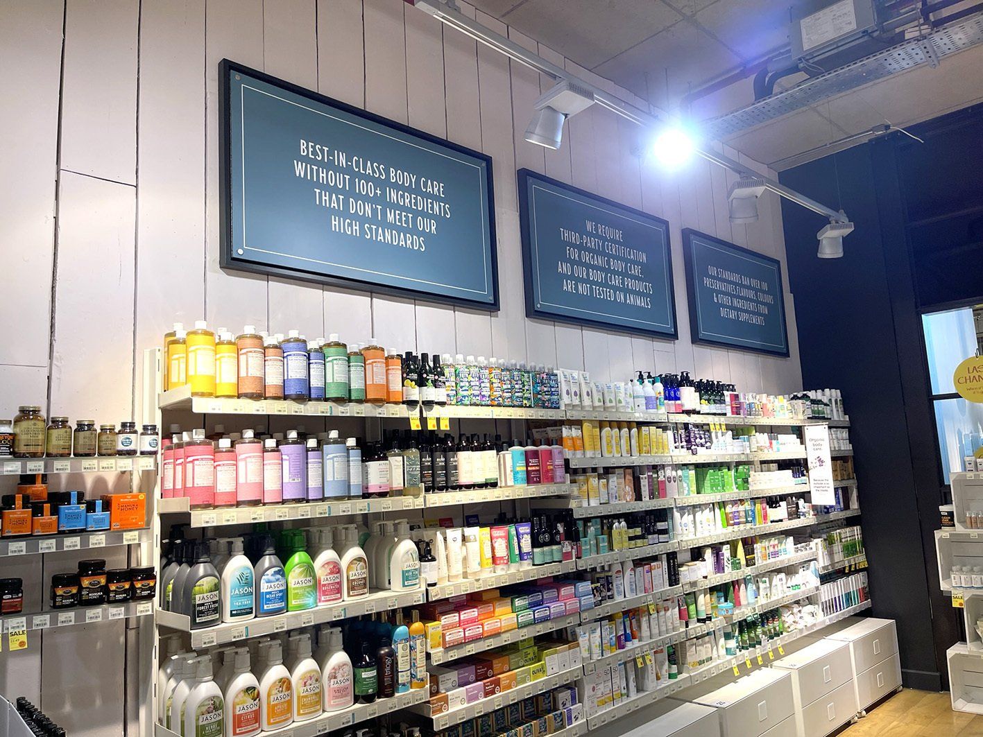
Slide title
Write your caption hereButton
Whole Foods Market, Richmond Store Decor Refresh
Continuing their bespoke creative signage scheme design – Whole Foods appointed us to supply and install the internal signage of the 2 floors of their Richmond store. Work consisted of hand painted wall designs, fret cut and painted acrylic letters, LED lightboxes and screen-printed acrylic panels. Installation was out of hours and completed over a 3-week period and was greatly received both here in the UK and the USA where they have over 500 stores.
 Button
Slide title
Write your caption hereButton Button
Slide title
Write your caption hereButton
Slide title
Write your caption hereButton
Slide title
Write your caption hereButton
Slide title
Write your caption hereButton
Slide title
Write your caption hereButton

Slide title
Write your caption hereButton- Button
 Button
 Button
Slide title
Write your caption hereButton
Slide title
Write your caption hereButton
Slide title
Write your caption hereButton
Guildford Cathedral
The old main external signs, were in dire need need of restoration, so we were selected to take on this project. Storing the signs for 6 months in our workshop to dry them out, we sanded down the painted areas and v carved the new welcome lettering. The timber was then stained and osmo oiled and the lettering infilled in white. The top section was prepared, high gloss finished and then lettering in-filled in white. Installation was just in time for the Cathedrals Carol concert which played a big part in the visitor experience.

Slide title
Write your caption hereButton- Button
 Button
 Button
Slide title
Write your caption hereButton
Slide title
Write your caption hereButton
Slide title
Write your caption hereButton
Guildford Cathedral
The old main external signs, were in dire need need of restoration, so we were selected to take on this project. Storing the signs for 6 months in our workshop to dry them out, we sanded down the painted areas and v carved the new welcome lettering. The timber was then stained and osmo oiled and the lettering infilled in white. The top section was prepared, high gloss finished and then lettering in-filled in white. Installation was just in time for the Cathedrals Carol concert which played a big part in the visitor experience.
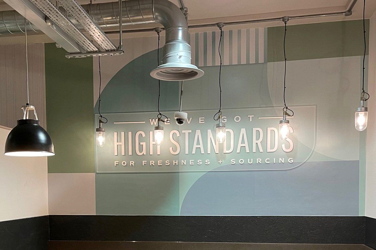
Whole Foods Market, Fulham Store Refresh
We jumped at the chance to work on our second Whole Foods store in a year. With regular communications and discussions with their appointed American Design Agency, we set to work on their internal signage over their 2 floors. Work consisted of LED illuminated lettering and lines, painted acrylic panels and letters, hand painted wall designs, bespoke acrylic fascias and digitally printed wall paper. Feedback has been very positive from the UK and the USA.
 Button
 Button
Slide title
Write your caption hereButton
Slide title
Write your caption hereButton Button
Slide title
Write your caption hereButton
Slide title
Write your caption hereButton
Slide title
Write your caption hereButton
Whole Foods Market, Fulham Store Refresh
We jumped at the chance to work on our second Whole Foods store in a year. With regular communications and discussions with their appointed American Design Agency, we set to work on their internal signage over their 2 floors. Work consisted of LED illuminated lettering and lines, painted acrylic panels and letters, hand painted wall designs, bespoke acrylic fascias and digitally printed wall paper. Feedback has been very positive from the UK and the USA.
 Button
 Button
Slide title
Write your caption hereButton
Slide title
Write your caption hereButton Button
Slide title
Write your caption hereButton
Slide title
Write your caption hereButton
Slide title
Write your caption hereButton
 Button
 Button
 Button
Slide title
Write your caption hereButton
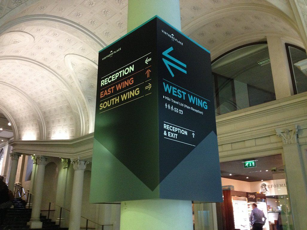
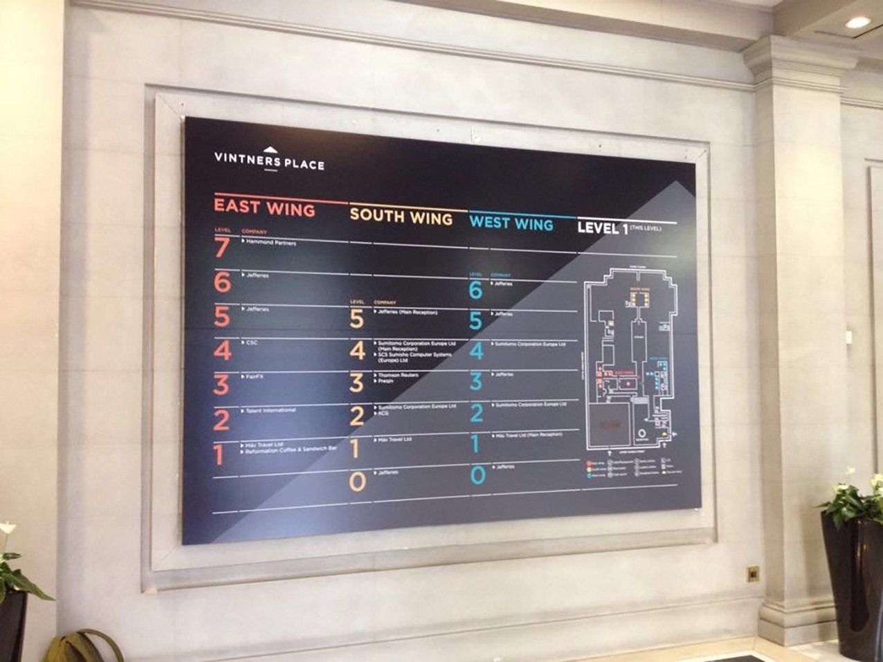
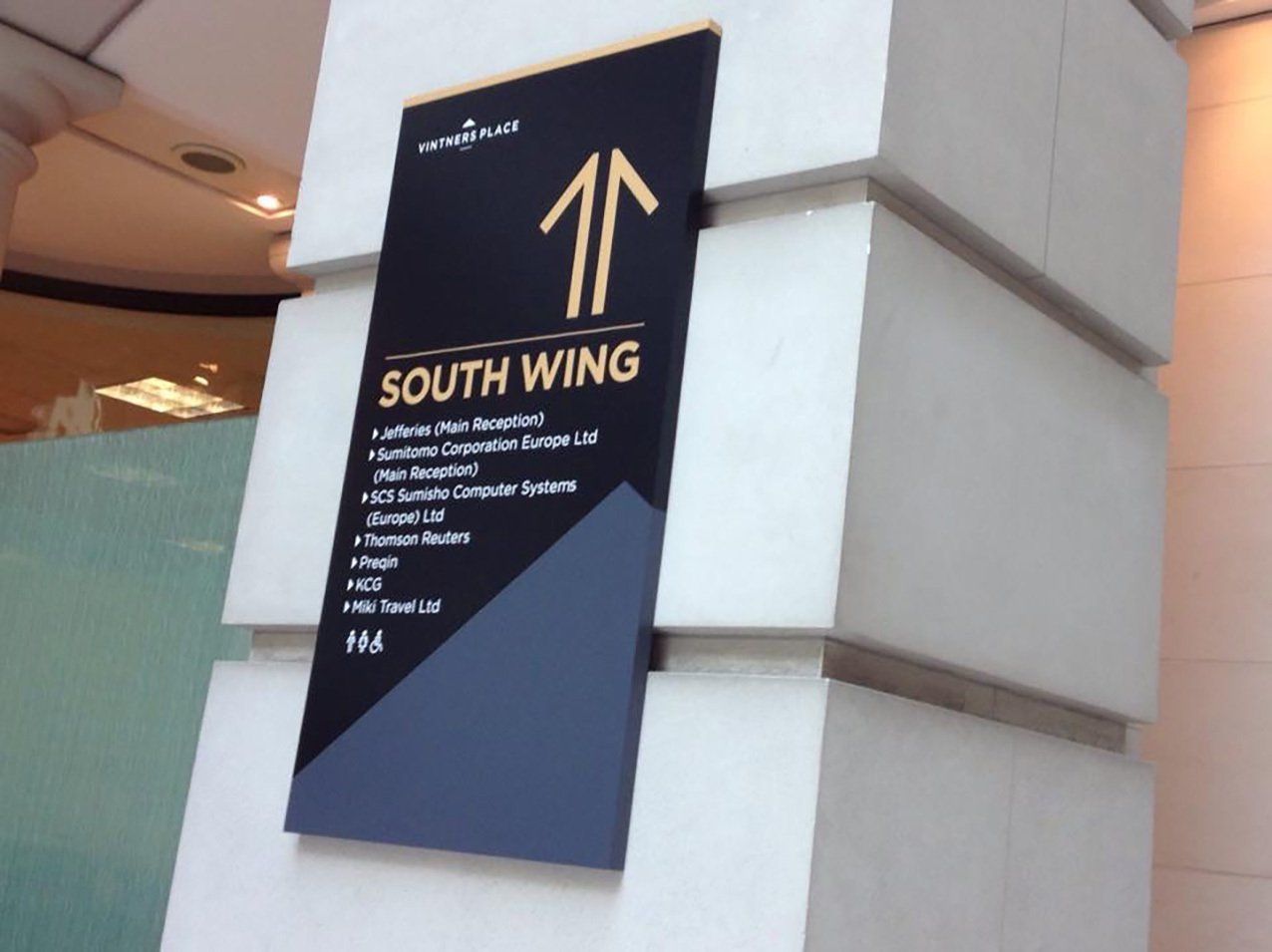
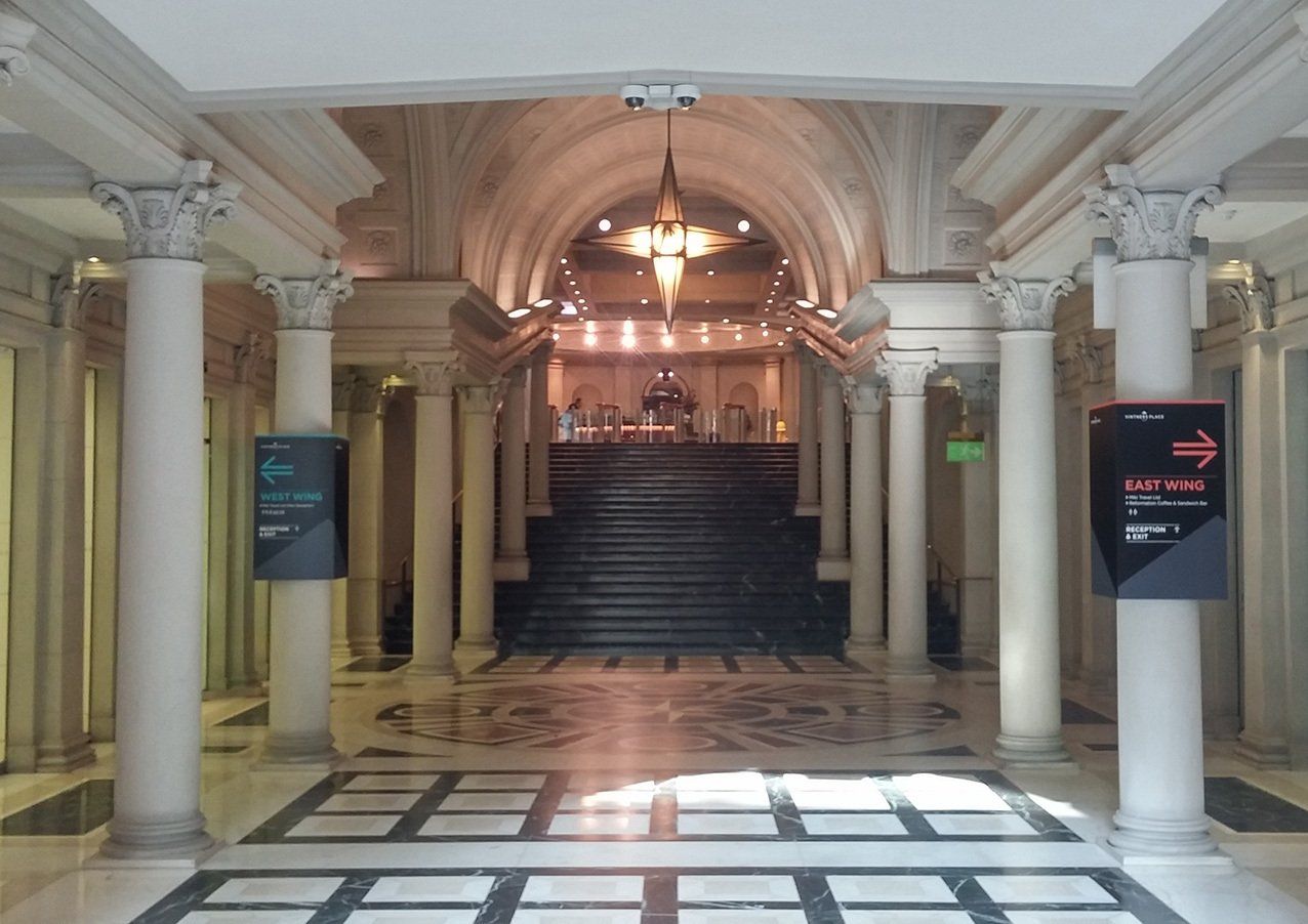
Vintners Place, London
Working close with a design agency, we replaced all the existing wayfinding signage with new bespoke MDF sprayed and printed, making the best use of the architecture to give the best results.
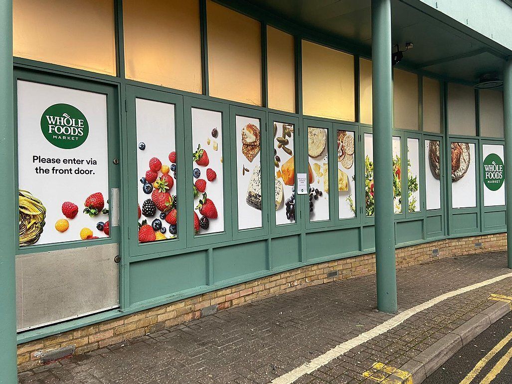
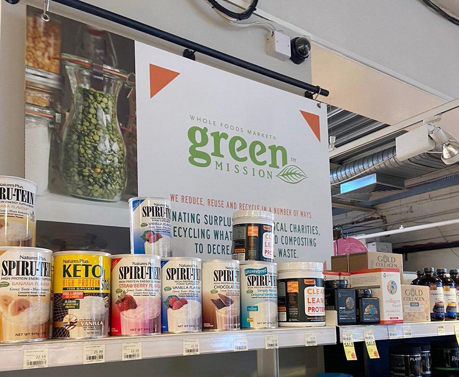
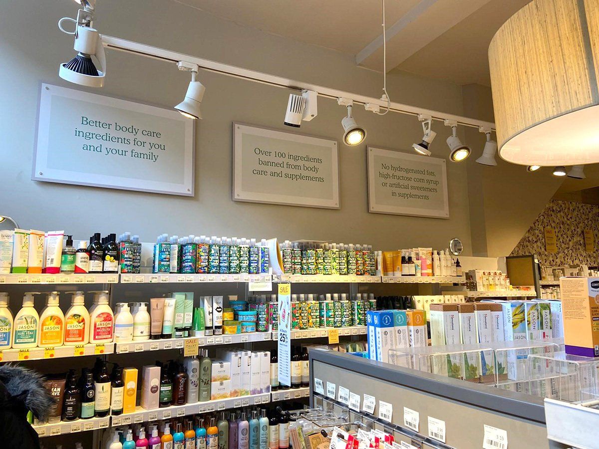
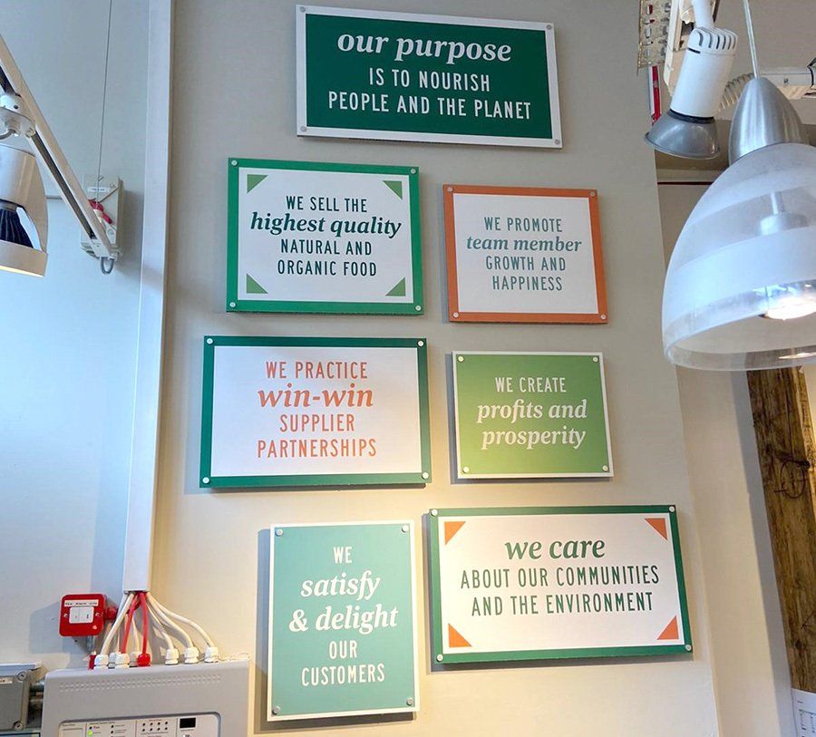
Whole Foods Market, Stoke Newington
The store was undergoing a revamp and so we installed some external acrylic letters, bespoke illuminated projecting signs, internal duffalyte signage and finished off with matt sealed external digital prints to the glazing. Taking into consideration the architecture and finishes of the building we installed satin acrylic fret cut letters to the two external fascias.
 Button
Slide title
Write your caption hereButton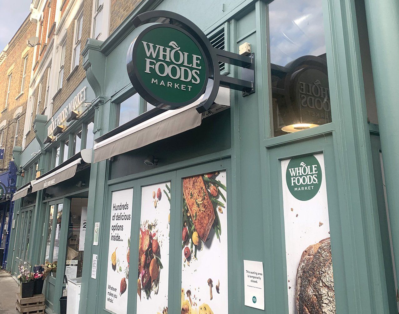 Button
Slide title
Write your caption hereButton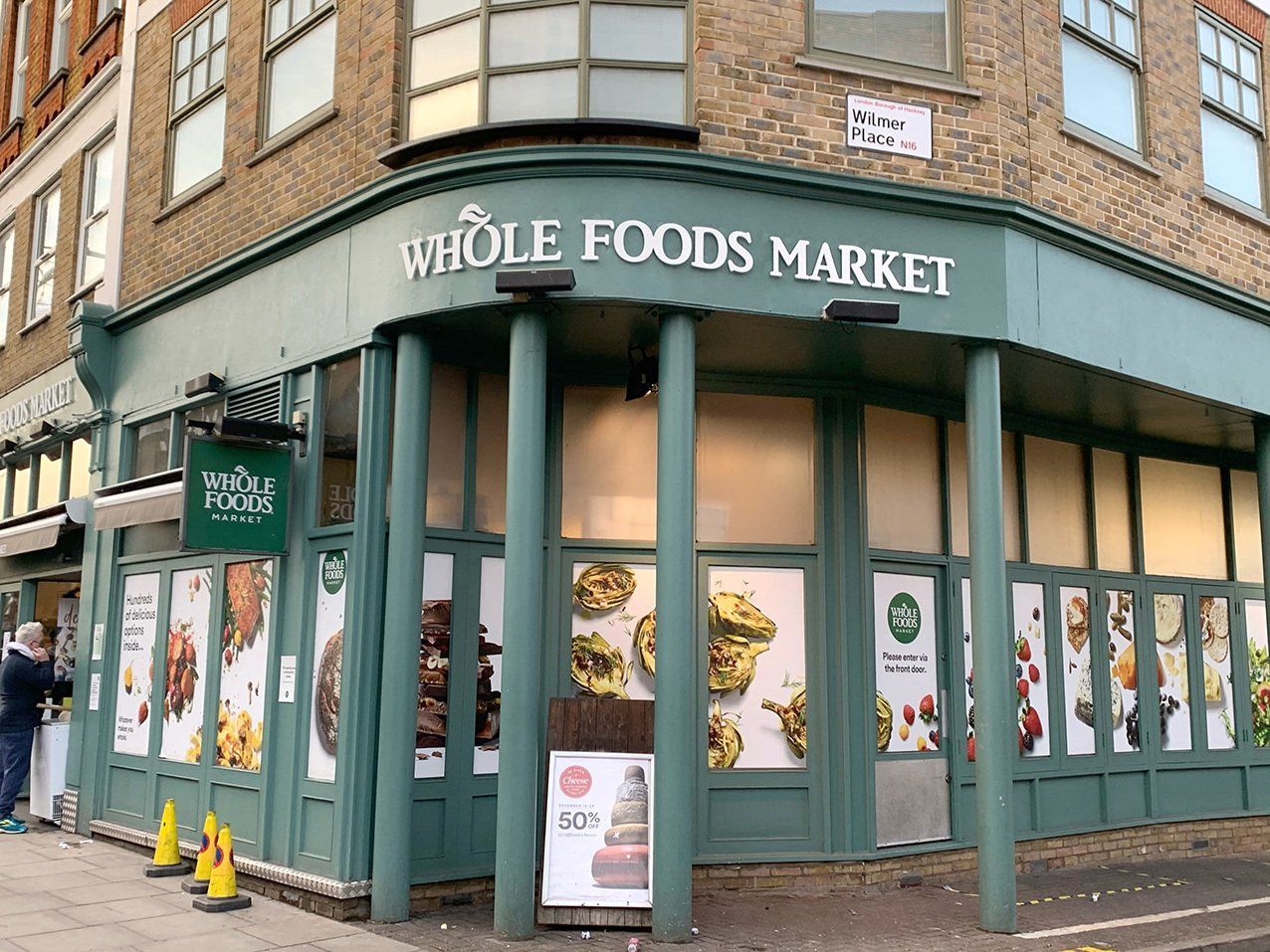 Button
Slide title
Write your caption hereButton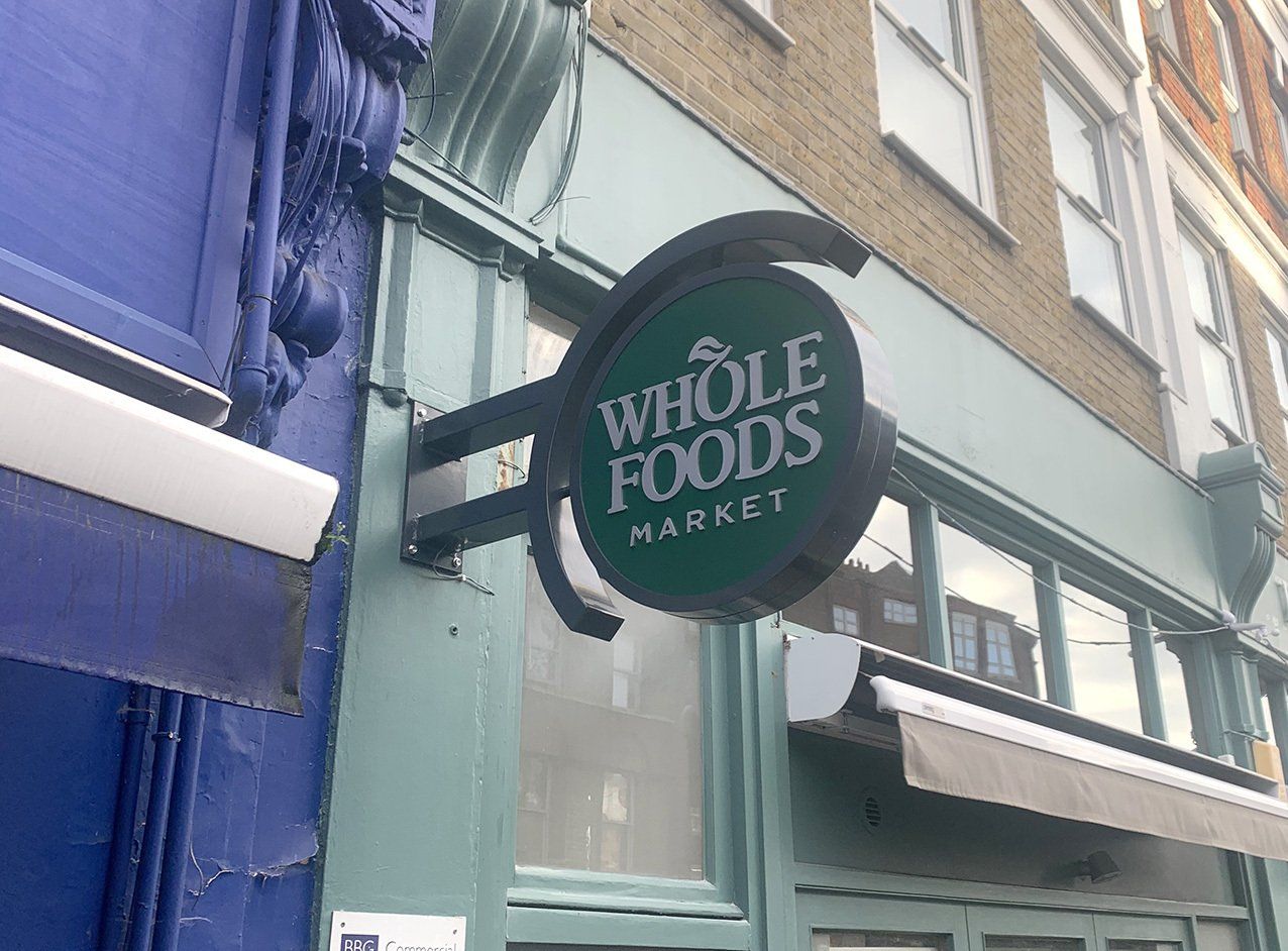
Slide title
Write your caption hereButton
 Button
 Button
 Button
Slide title
Write your caption hereButton
Vintners Place, London
Working close with a design agency, we replaced all the existing wayfinding signage with new bespoke MDF sprayed and printed, making the best use of the architecture to give the best results.
Whole Foods Market, Stoke Newington
The store was undergoing a revamp and so we installed some external acrylic letters, bespoke illuminated projecting signs, internal duffalyte signage and finished off with matt sealed external digital prints to the glazing. Taking into consideration the architecture and finishes of the building we installed satin acrylic fret cut letters to the two external fascias.
 Button
Slide title
Write your caption hereButton Button
Slide title
Write your caption hereButton Button
Slide title
Write your caption hereButton
Slide title
Write your caption hereButton
 Button
 Button
 Button
Slide title
Write your caption hereButton
Vintners Place, London
Working close with a design agency, we replaced all the existing wayfinding signage with new bespoke MDF sprayed and printed, making the best use of the architecture to give the best results.
Whole Foods Market, Stoke Newington
The store was undergoing a revamp and so we installed some external acrylic letters, bespoke illuminated projecting signs, internal duffalyte signage and finished off with matt sealed external digital prints to the glazing. Taking into consideration the architecture and finishes of the building we installed satin acrylic fret cut letters to the two external fascias.
 Button
Slide title
Write your caption hereButton Button
Slide title
Write your caption hereButton Button
Slide title
Write your caption hereButton
Slide title
Write your caption hereButton
Signmode.
Makers of beautiful signs.
Visit
Studio 6, Silks Yard
Church Hill, Horsell, Woking
Surrey GU21 4QE
Signmode.
Makers of beautiful signs.
Visit
Studio 6, Silks Yard
Church Hill, Horsell, Woking
Surrey GU21 4QE
Signmode.
Makers of beautiful signs.
Visit
Studio 6, Silks Yard
Church Hill, Horsell, Woking
Surrey GU21 4QE
Contact
© 2024. Workmode Limited T/A Signmode.
Company No. 12443188
© 2024. Workmode Limited T/A Signmode. Company No. 12443188
© 2024. Workmode Limited T/A Signmode.
Company No. 12443188
